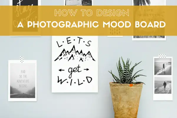
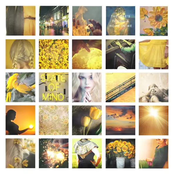
When you’re working on a design or photography project for a client, a mood board can be one of the best ways to get your vision across. A mood board is essentially a collage of things that inspired you for this particular project. They can help you really nail down the look and feel of your work, and make sure it’s cohesive. But they’re not just for the designer; they’re also a great way to present your work to your client and showcase what you do.

We’re going to walk you through some of our expert tips for designing a fantastic mood board that helps both you and your client achieve the result you want. In other words, it’s a win-win!
10. Choose your method – digital or physical?
Depending on what you’re into you might really enjoy piecing together a mood board online, or you might prefer making one with your own two hands. Both formats can work really well depending on what type of content you’re displaying.
Keep in mind both what you like working with personally and how your format is going to help your clients see and understand your vision.
9. Think about size and position
If an element on your mood board is particularly important, you should make it stand out. A rule of thumb is this – the size and position should reflect how important that thing is. It’ll make it easier for you (and your clients) to focus on the key stuff.
You can also use colour to help you express an idea, so on that note…
8. Choose your colours carefully
The right colour palette is always an important design choice, and that definitely goes for mood boards too. Choose a specific style for your board, and use your colours to help define the style. Think about what you’re trying to convey for the project, and use that as a jumping-off point to pick colours. If you’re not sure where to start, try using this guide.

7. Less is more
A mood board is just a one-page thing. It can be tempting to throw absolutely everything cool onto your mood board. But that can result in a confused client who isn’t sure what the main point is.
If you can get your message across in just a few images, do it. If you’re working with inspiration words too, a few well-placed, thoughtful words can really wow your client. Don’t overwhelm your client with too much information. Just stick to the key message.
6. Use online tools to your advantage
There are so many places you can create a mood board online. Try sites like Gimme Bar (to create a library of content) and Compfight (to find Creative Commons images on Flickr) to get you started. Of course, social media is also a fantastic place to find inspiration. Search for images on Google and Pinterest, and have a look around
Instagram for a treasure-trove of cool visual content. There are also a ton of mood board templates available online, which can be really useful to help you nail down your idea and display it properly.

5. Experiment
You may decide to put together a few different mood boards for the same project or concept and then decide which one you like best. This can be a great way to show clients different variations you could do on the same concept, too.
Experiment with where you find your mood board content as well. Just because an image doesn’t fit 100% within the genre you’re designing for doesn’t mean it can’t be a great part of your mood board. You can even test things out on your friends and family to get feedback on what works best.
4. Always be on the lookout for inspiration
Whether that means taking a short walk around the block for a breath of fresh air or doing a quick Google search to see what images pop up, potential inspiration is everywhere. If you’re keeping an active eye out for interesting stuff, you may be surprised at how much you come across.
3. Be obvious about what your idea is
Showing a mood board to a client helps them understand your vision so you can make sure you’re on the same page, so don’t make it something that’s tough to understand. Make your ideas clear so they get it right away. Sometimes a designer and a client may think they’re talking about the same idea, but might actually mean quite different things. Mood boards give you a visual tool to make sure you agree.

2. Don’t get stuck on one idea
On the same note from the point above, your client may get your vision – but wasn’t quite going for the same thing. Don’t get hung up on an idea to the extent that you can’t let go of it down the line.
Instead, keep things flexible enough so that you can modify them later if your client needs. This might mean letting them know you’re open to change. Some designers use watermarked versions of images before finalizing the process as a heads-up that the first version of the mood board is just a test.
1. Have fun!
Doing a mood board isn’t supposed to be a boring chore. Mood boards can show your client just how imaginative you are, so flex your creative muscles and have a bit of fun. Play around with the structure, the format, the layout, the typography, the style, the colours – whatever you like!


1 comment