Having a proper business card is the first step towards establishing branding as well as earning potential customers, regardless of whether you are a freelance photographer or engaged within photography agencies. Not only do they serve to boost the reputation of an individual or corporation, they are also an opportunity to showcase the many good qualities one has to offer. By investing in a good business card of your own, you will have essentially created the best possible marketing tool you have within your arsenal.
 If you are deciding whether to create your own business card, here are some tips for the process of creating a good one.
1. Design
Coming up with a card design for your photography business card should be the first step to undertake. One of the benefits of cards is that they allow much room for creativity, and one can decide to apply design on just one side or both sides of their business card. With this in mind, decide if you want to use both sides or just one. Next, begin with the creation of your card design concept. One recommended factor would be to create a design that can communicate the nature of your business to your potential customers at just a single glance.
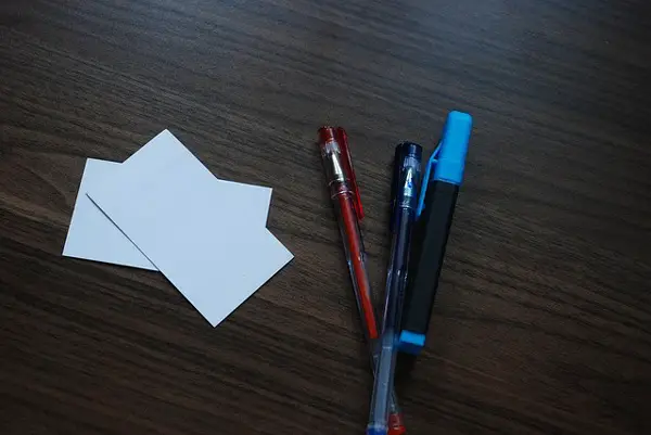 Image courtesy of Pixabay
You can make use of association by choosing to include card designs that resemble the film used in photography, a camera or other similar shapes. You can also choose to replicate a photograph or a specific style of photography that you happen to specialise in. If you are feeling particularly creative, you can also use an actual photograph as the background of your card. To give yourself an added advantage, take the time to do some research. Look at the business card of your competitors and what other photography agencies have been producing. Take note of the common design elements they are using. By understanding what is currently most relevant, most used and what works, you will be able to choose better business card designs for yourself.
2. Content
Once you have settled on a design, it is also time to consider the contents of your business card. A good recommendation would be to keep the information disclosed clean and concise- cut down on what is unnecessary and keep the information that users can rely on to contact you. This prevents over-cluttering your business card and improves the focus as well as professionalism your business card has. Important must-have information can include your name, the name of your photography agency, the address of your agency, your email address as well as phone numbers. If you have ample space for other information, you can choose to include them as well.
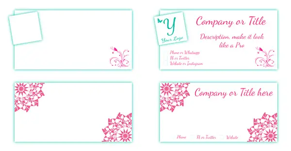 Image courtesy of Pixabay
For those who have decided to make use of double sided business cards or folded business cards, you can also consider including the social signals of your corporation or slogans. Social media platforms serve quite an amount of success when it comes to customers interacting and sales conversions so by doing so, you give yourself an added advantage of having your customer look you up. If you are looking for special methods of conserving space for more information, or to encourage users to look for your products and websites, you can also insert elements like QR codes for a sense of mystery.
The fonts used to display and showcase your card contents are also design factors that can be considered. What kind of fonts combine well with photography? What combinations can you use to associate them back to your own photography style? Can you recreate certain moods and messages by experimenting with their spacing and alignment? For consistency, you can make use of one font. But playing around with a combination of different fonts that complement each other can further display your artistic eye. You can also make use of customised fonts as well to showcase your individuality.
3. Visuals
Besides content and design, colour schemes and visual engagement are both factors to incorporate too. For photographers, the colour schemes available also vary. Most photography agencies stick to colours like black, white or sepia tones to recreate photography effects. If you are feeling particularly adventurous, you can try out vintage themed colours or even modern minimalistic effects. Consider the photographs you or your agency produces and what colour schemes are commonly within them. Take a look at the logo design you have- what colour schemes can complement it the most?
 Image courtesy of Pixabay
Alternatively, you can also recreate colour gradients or add in visual elements like geometric shapes, the shape of photo lenses, small sections of your photographs and more! Keep in mind that these visuals are also used to enhance your business card so use them liberally. Whenever possible, experiment with your business card design by implementing different colour combinations and seeing what effects it brings. The texture of the material you use to print on can also cause certain changes to your colour scheme and display so try to keep that in mind as well.
4. Material
The material you are using to print your business card on should be taken into consideration as well. Ideally, you want to look for stock material that holds a proper weight to them. This reduces the possibility of having your business card bend, fold or even tear when users carry it with them. The better quality material you are using, the better impression it makes on others since they perceive that you carry professionalism even in the most subtle of aspects. Another factor to consider apart from durability would be shelter from the elements. Whenever possible, select card stock material that holds a degree of water resistance so your card will not be damaged when in contact with rain and other liquid forms.
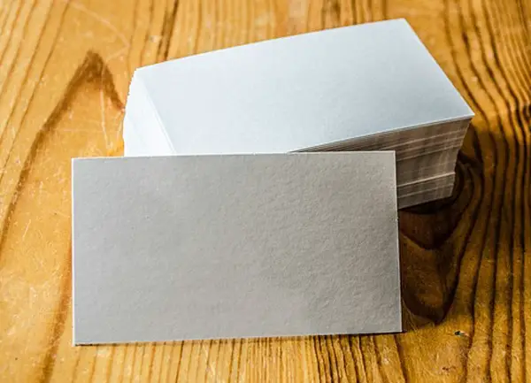 Image courtesy of Pixabay
Apart from water resistance, it is also useful to take note of how much ink is going into your print job and if the material is durable enough to accept the amount of ink. This is even more crucial if you are printing on two sides. If you are unsure, ask for samples at printing shops or do a few test prints yourself to see how well the ink works on your material of choice. Do also take note that depending on the card stock material you choose, the availability of finishing options changes as well. Certain material is incompatible with finishing options that you may require so it is a good idea to look into it before purchase. Consult your printing service on this and ask for alternatives if they are able to suggest some.
It is also worthwhile to note that certain printing services are able to offer specialty papers and other novelty material. If you are looking for something adventurous to combine with your photography business card, you can experiment with different specialty papers at different prices.
5. Finishing Options
Most printing and card design services are also capable of offering additional finishing options. Bear in mind that these finishing options are present to enhance the overall effectiveness of your card design. Using too much of them can actually detract your customer’s attention from what should really be the focus of your business card and make information hard to find, so make sure to use finishing options conservatively. Research into the commonly used finishing options and consider if they are applicable to your card design. Communicate with your designer and printer to ensure that the options chosen are feasible and easy to recreate on your actual business card. A good number of finishing options one can pick should be limited to two or three at a time.
If your photography business card is simple in it’s design, you can liven things up by highlighting different sections with elaborate finishing options like foil stamping. Whereas if your business card contents and designs are already the focus, you can add subtle finishing options like embossing or debossing to create a textural difference. With this concept in mind, pick finishing options that serve to draw the focal points of your readers attention to the right details by experimenting with different combinations and options. For particularly adventurous users, you can also consider changing certain elements in your card with die cutting and other interesting options.
6. Preparation For Print
Apart from focus on design elements, it is also important to prepare your business card for print. Understand that your business card will require to be cut and separated after the printing, and therefore you must include a bleed area so that the cutting does not interfere directly with the rest of your name card design. This is also crucial to note if you are including borders since there is a chance that the finished product will look misaligned. In the event that you are unsure of how much thickness to use as a bleed area, check with the printing service you are using. Most design and printing services are also willing to provide an editable template for you to download and include your business card design in, so do so to ensure that all your required elements are within the bleed to minimise any accidents.
Your business card should have all text either embedded or outlined clearly, with guidelines and colour scheme blocks removed so they won’t be accidentally included when you print your cards. Make sure that you are able to preserve quality by saving it as a vector based file instead of JPEG or even PNG file formats.
Before printing, run clean or scrap paper a few times to ensure that ink residue is completely removed so that you can improve the overall quality of your print. It is also essential to make sure that your printer, or the printing service providers are capable of producing your desired printing process before you proceed. If you plan to add on further finishing options or embellishments, take care to track the process so that it can be performed in a timely manner by preparing the additional materials and setting up to ready them to minimise time.
7. Creation
After finalising your card design, it is time to begin preparing the contents of your photography business card. A good recommendation would be to use software programs that are compatible with your requirements. For example, if you intend to mix photographs and design elements like borders, shapes, logos, text and other relevant examples, you can choose software programs like Adobe Illustrator. They are designed to facilitate by providing the ability to create clean and scalable designs. Make sure to create your business card in the best possible quality/size. Once you have done so, you can begin checking for quality by conducting a few test prints.
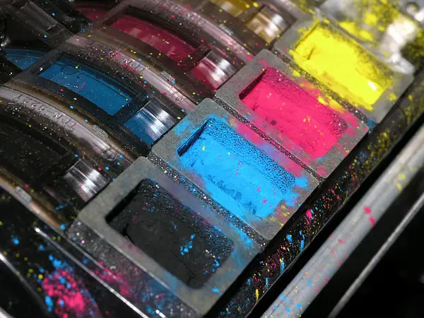 Image courtesy of Pixabay
It is a good idea to match the colour settings of your printer with the colour settings you have seen on your computer screen. As another added recommendation, make sure that your printer can facilitate printing in CMYK format, as well as other special finish options whenever necessary so that you won’t have to go through additional trouble. You can also take this moment to make any last minute additions that are required. If you are satisfied with your test print, you can carry on printing the rest of your photography business card bundles. Remember not to be complacent and to check on the quality of your printed business cards on a semi-regular basis- this ensures quality control. You will be able to detect if anything goes awry and conserve resources immediately.
These are just some of the useful tips one can undertake in their process of designing and creating a good business card for themselves. By using these included tips as guidance, you will be able to easily navigate through the whole procedure and experiment with different materials, finishing options and embellishments.
Let me know if you have any questions.
For more information on designing business cards, try this link.

