Have you ever taken a photograph of something beautiful only to later find that the resulting image lacks the vivid colors and energy that were present in-person? Fortunately, Photoshop offers a plethora of color correction tools that can help you salvage images with defective color.
This guide will teach you how to utilize Photoshop’s color correction tools so that you can transform your lifeless photographs to match the beautiful memories inside your head.
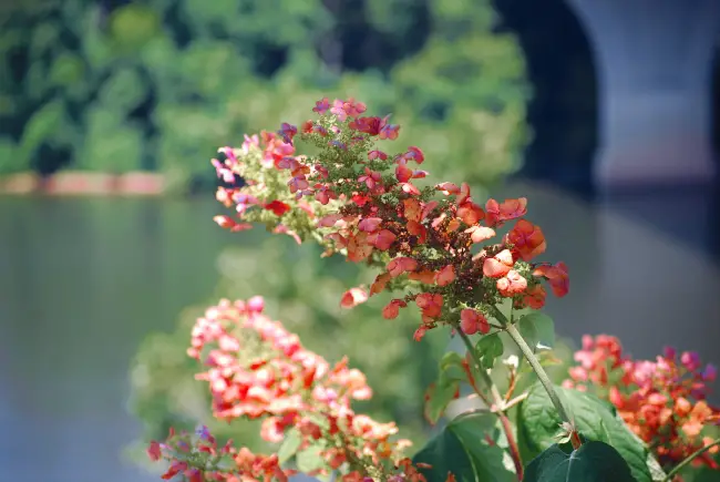
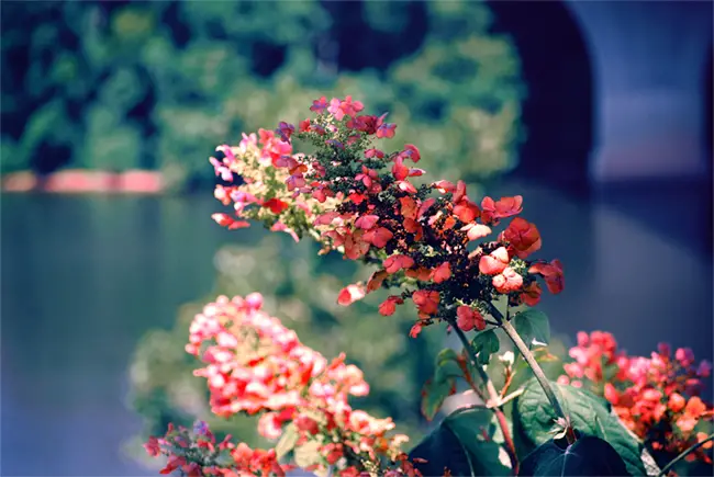
If you look closely at the photo below, you may notice that although the flowers in the image are pretty to look at, the colors and contrast are a bit dull. Everything in the photo appears to be tinted with a faded, yellow-green color.
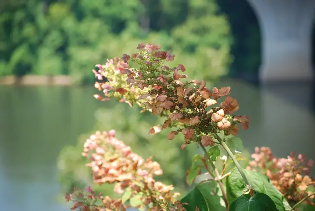
Although the photo has some problems, it is possible to push it to its full potential by adjusting and intensifying the colors using color correction tools.
Check out the following techniques that I used to correct the colors in this photograph.
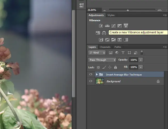
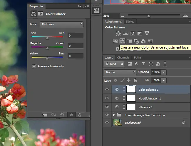
Inverted Average Blur Technique
The Inverted Average Blur Technique is a trick I stumbled upon when I was first learning Photoshop. It is easy, quick, and very useful for correcting a photo that appears tinted or has too much of the same color. It involves taking the average of the colors in the photo, filling a layer with it, and changing the blending mode to color to balance out any tint that your photo may have.
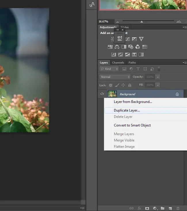
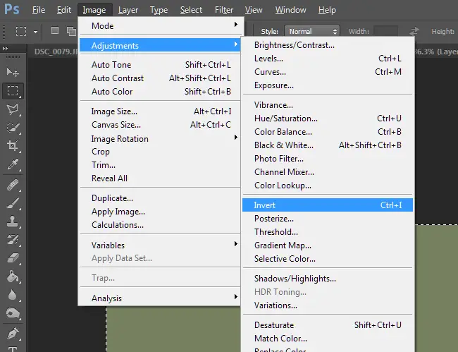
1. Duplicate the background layer.
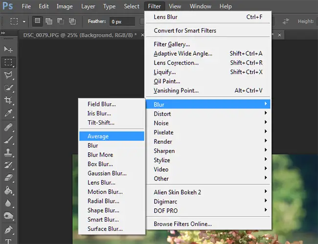
2. Select Filter > Blur > Average. This tool will pick out the color that is overwhelming the photo by taking the average of all of the colors in the image and filling the layer with that color.

3. Press Ctrl+I to invert the image. You can also do this by selecting Image > Adjustments > Invert. Now the image is filled with the opposite color of the average.

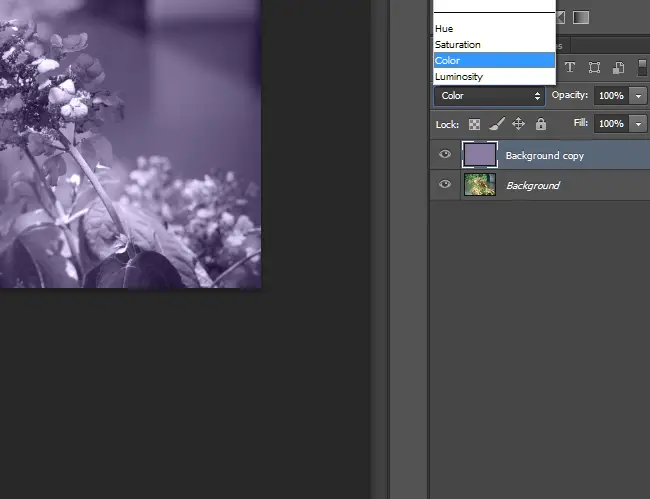
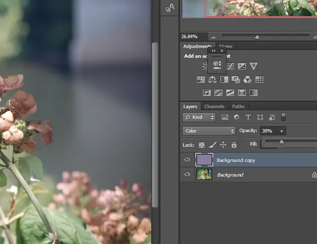
4. Head over to the Layers window and change the Blending Mode of the Background Copy layer to “Color.” Lower the Opacity until the image no longer appears tinted. I chose 30%, but this percentage could be higher or lower depending on how much color correction is needed.
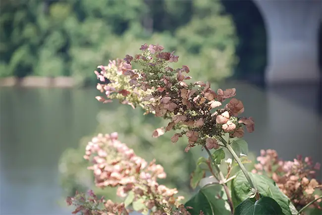
The colors in your image should now be mostly “corrected,” or closer to reality. However, it might be necessary to do further correcting using other color correction tools.
Vibrance / Saturation
After correcting the colors in my photo, everything now looks a bit desaturated. One way of fixing this problem is to create a Vibrance / Saturation adjustment layer to make the colors more vivid.
1. Select the Vibrance icon in the Adjustments window to create a Vibrance / Saturation Adjustment layer.
2. Move the Vibrance slider up to make dull colors more vivid, and move it down to make them less vivid. The Vibrance tool gives adjustment preference to the areas of the photo that are naturally less saturated. In other words, it increases the saturation of low-saturated areas, but leaves the areas that are already highly-saturated alone. It also attempts to avoid increasing the saturation of skin tones.
3. Move the Saturation slider up or down to make the colors more or less vivid. Unlike the Vibrance tool, this slider will affect all of the colors in the photo.
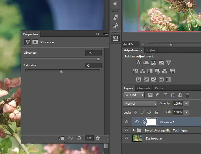
The values I chose to use for my photo were Vibrance: +96 and Saturation: -3. This made the colors in the flowers more vivid, while reducing the vividness of the background.
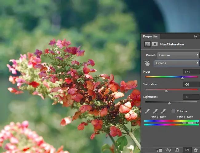
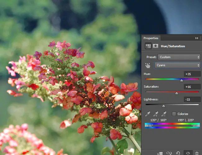
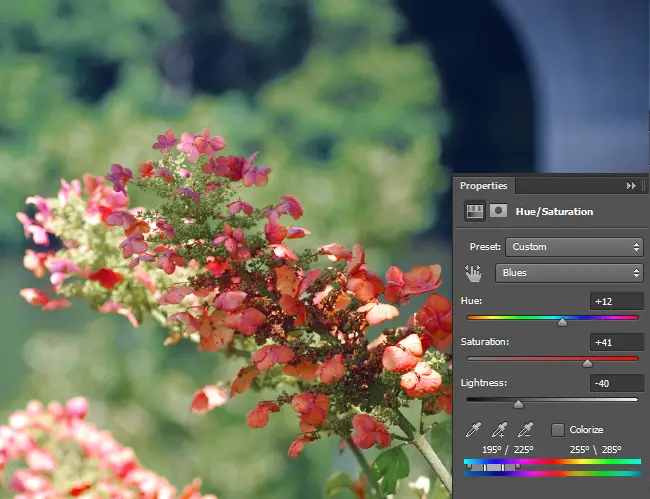
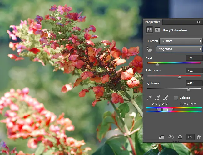
Hue / Saturation / Lightness
The Hue / Saturation / Lightness adjustment layer allows you to change the colors in an image as well as the saturation and lightness.
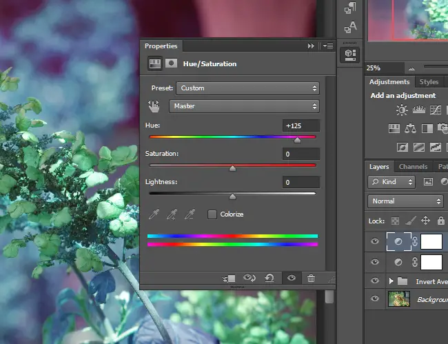
1. Click the Hue / Saturation / Lightness icon in the Adjustments window to create an adjustment layer.
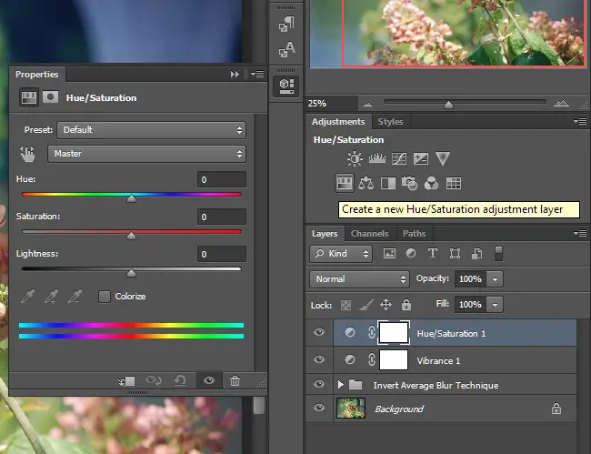
2. Move the hue slider to change the colors in the image. Notice that “Master” is selected in the drop-down menu. This means that any changes you make will affect all of the colors at once. I chose the value -18 to make the flowers contain more pink.
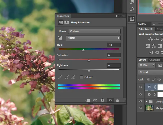
3. Move the Saturation slider to increase or decrease the vividness of the colors. This will affect all of the colors in the image. Since I already adjusted the Saturation of my image in the previous section, I chose to leave the slider at 0.
4. Adjust the Lightness slider to increase or decrease the brightness of the color range. Again, since the “Master” option is selected, this will affect all of the colors in the image. Since I prefer editing the brightness with other tools (such as levels and curves), I left the Lightness value at 0.
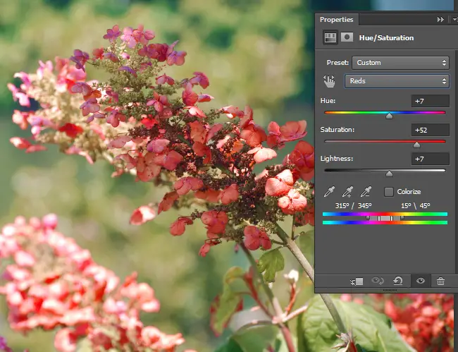
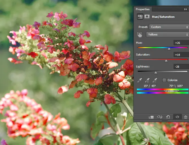
5. In the drop-down menu, select “Reds” instead of “Master.” Moving the Hue, Saturation, and Lightness sliders will now affect only the red areas of the image. Adjust these sliders to taste for every color in the drop-down menu. The goal here is to make the colors in the image more interesting while also making the subject or focal point stand out more.
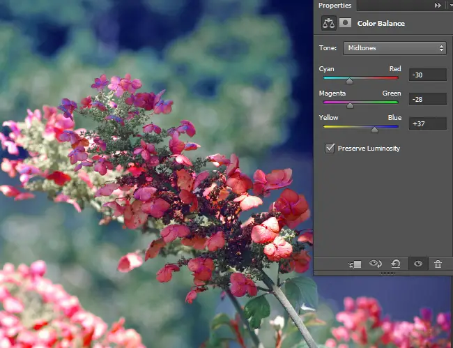
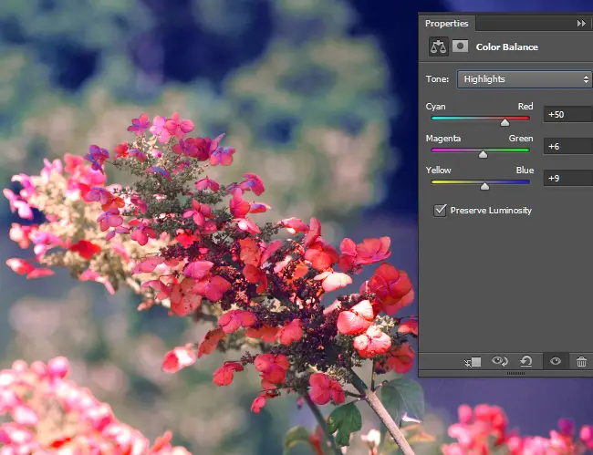
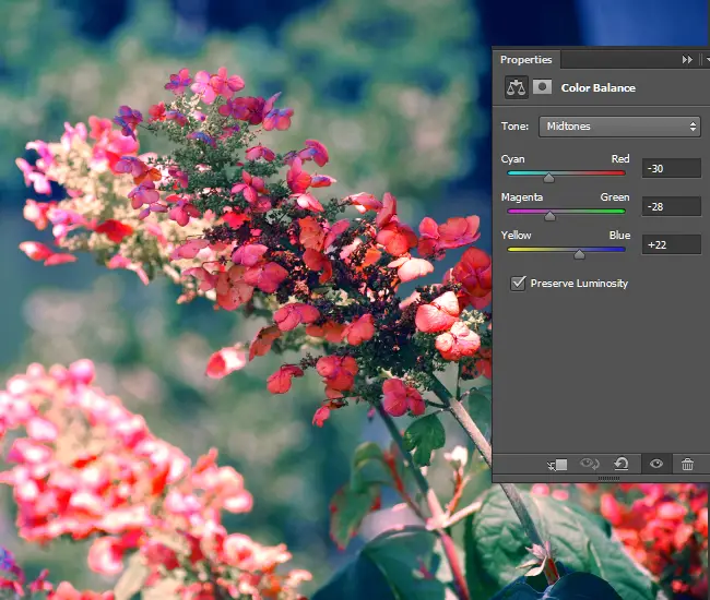
Color Balance
The Color Balance Adjustment Layer tool is one of the easiest ways to achieve color correction. The tool allows you to adjust the color values for the shadows, midtones, and highlights in the image.
1. Click on the Color Balance icon in the Adjustments window to create a Color Balance Adjustment Layer.
2. With “Midtones” selected in the Tones drop-down menu, move the sliders back and forth between Cyan and Red, Magenta and Green, and Yellow and Blue until you are happy with the effect.
3. Select Highlights from the Tones drop-down menu. Repeat step 2 for both the Highlights and the Shadows.
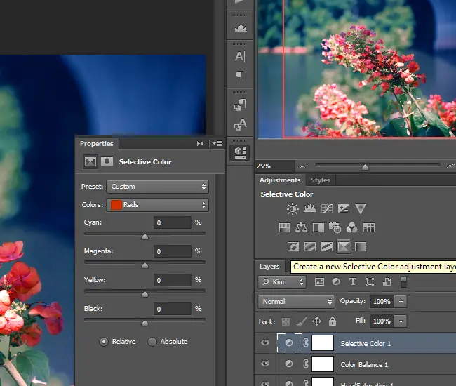
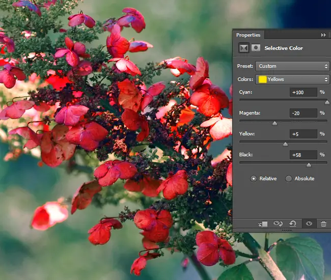
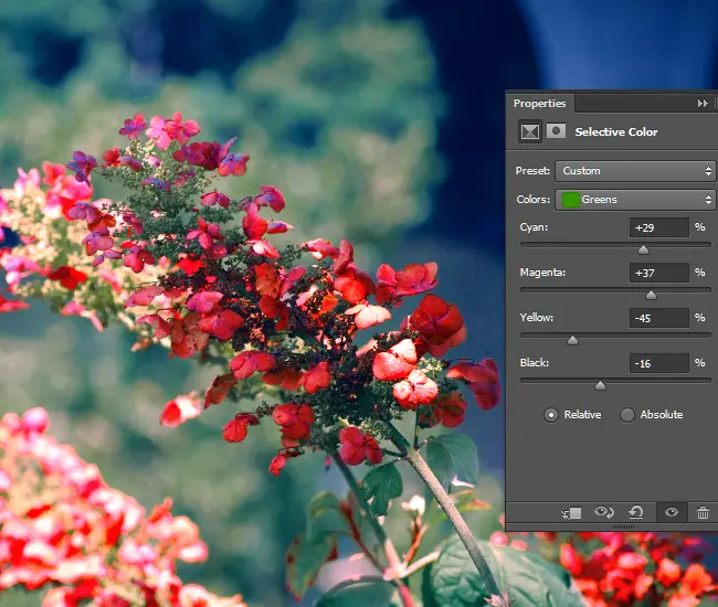
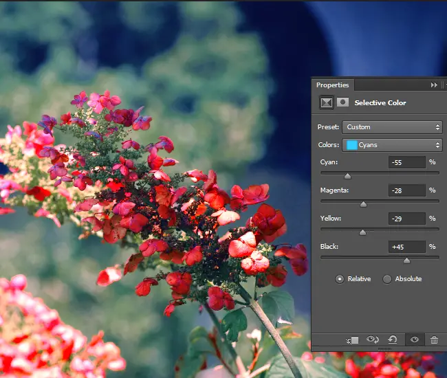
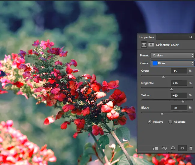
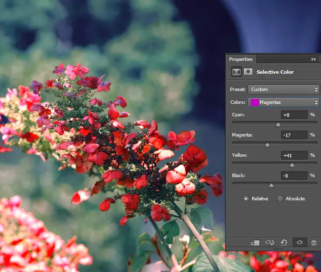
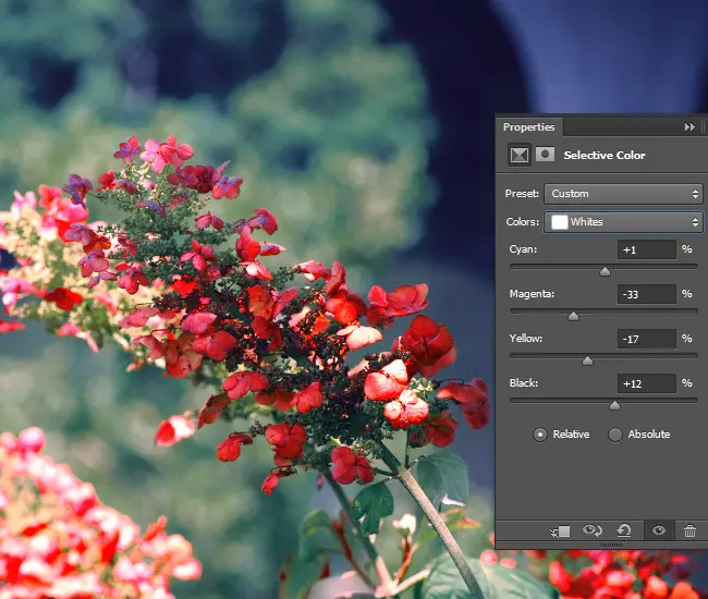
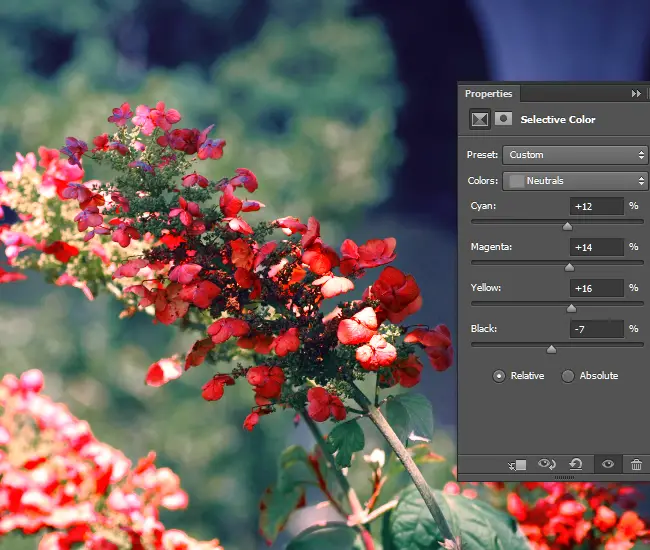
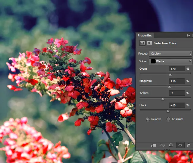
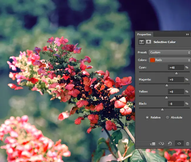
Selective Color
The Selective Color Adjustment Layer tool allows for the CMYK values to be increased or decreased within each color channel. For example, you can change the intensity of Cyan in the Red areas of the photo. You can use this tool to greatly alter the colors in an image.
1. Select the Selective Color icon in the Adjustments window to create a Selective Color Adjustments Layer.
2. Move the Cyan slider to the right to increase the intensity of Cyan in the Red areas of the photo. Move it to the left to decrease the intensity. Do this with the Magenta, Yellow, and Black sliders as well.
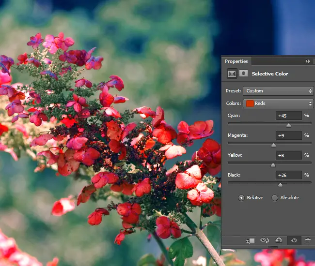
3. Select Yellow in the Colors drop-down menu, and repeat step 2. Adjust the CMYK sliders for each color channel until you are happy with the image.
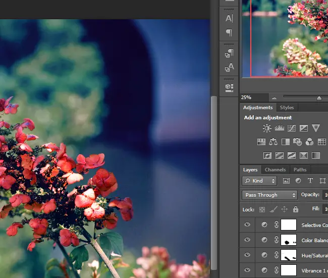
After you’ve finished making all of these color corrections, I suggest going back through and cleaning up any areas that look unrealistic or over-saturated using the layer masks on the adjustment layers. Any areas that you color over with black on the layer masks will not be affected by the corresponding adjustment layers.
As you may have noticed, the color alterations that I made to my photo caused the flowers in the background to have a halo effect, so I used a soft brush and painted black over these areas on the layer masks of each of the adjustment layers. This prevented the adjustment layers from affecting those areas of the photo.
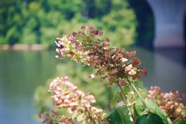
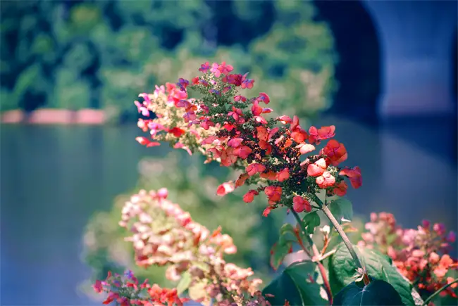
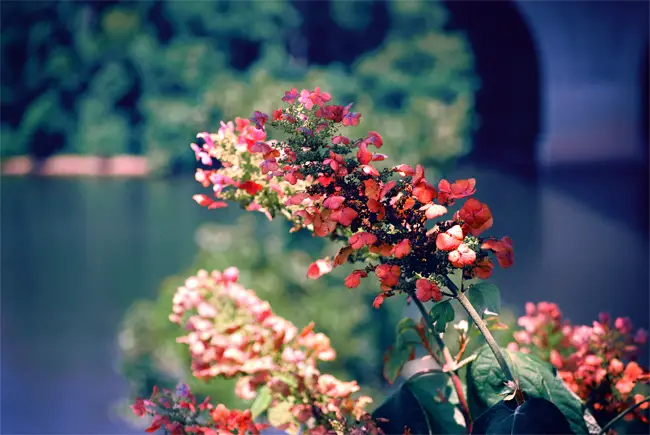
Final Effect


great tutorial. very useful. so many photographers do bad color retouching, even the great ones.
that was awful……this is whats wrong with photography……you
Great photographic tutorial….. really like it.
Interesting read. I don’t do a lot of work with photography, but I dabble a little and this was very helpful. thanks for the tutorial.
Good Job….
I am working hard on it. Now I know that you know that it can. Thank heavens for God’s unwavering grace.