Designing a business card doesn’t have to be difficult or time-consuming. Most business cards are simple enough: they contain, in readable type, a list of information about you, what you do, and how to get in touch.
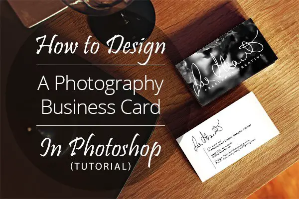
They stay in tune with your branding — the colors, fonts and general message you want to convey to people about your business — so there’s a clear link between them and your portfolio. And they give a little peek into what you do. In this tutorial, I’m going to show you how to design a simple double-sided business card.
The Front Side
What you do is photography, so from the get-go you have a whole library of possibilities to choose from for the front of your card. You can even just slap a picture on it and call it a day. You can also use your logo, if you have one — or you can combine both things! Here’s how to do the latter:
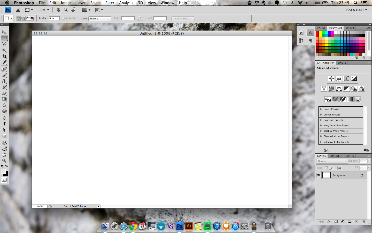
- 1. Open a new file in Photoshop the size of the card you want to print. If you’ve picked a printer already, check their requirements! If you haven’t, 85 x 55 mm and 3.5″ x 2″ are fairly common sizes. You can adjust the size afterwards if required. I’ll be designing a 84 x 55 mm card — Moo sizing.
Make sure you go with 300 pixels per inch. You’ll get a relatively large file on your laptop screen, but remember it will print the size of a credit card, so don’t cram things in or make your text tiny! This will be particularly relevant when we design the back of the card.
2. Choose your photo! Here are two questions to help you pick:
– What are you advertising with your card? Think about who you’re likely to give the card to, and what you want them to want from you. Is it product photography? Stock? Buy your fine art prints? Hire you for portraits? Pick something that shows you’re capable of the thing or things you want potential business card recipients to know you offer. If you do a lot of different things, pick something you’re particularly proud of, or create multiple covers so you can give them out to different people! Note that many printing services won’t print different cards in the same batch, but some do. Moo is one of them.
– Look at your logo, or think about what you want to overlay on the image, and pick something that will look good with it. Do you need negative space for an illustration? Think about where you’re positioning the logo and how much space you want it to take up, and try to choose an image that has even shades in that space — something that doesn’t go from white to black to white to black is easier to work with than something that does, unless you’ve a logo small enough to put in a solid-color box (or some other shape box) — and you like boxes.
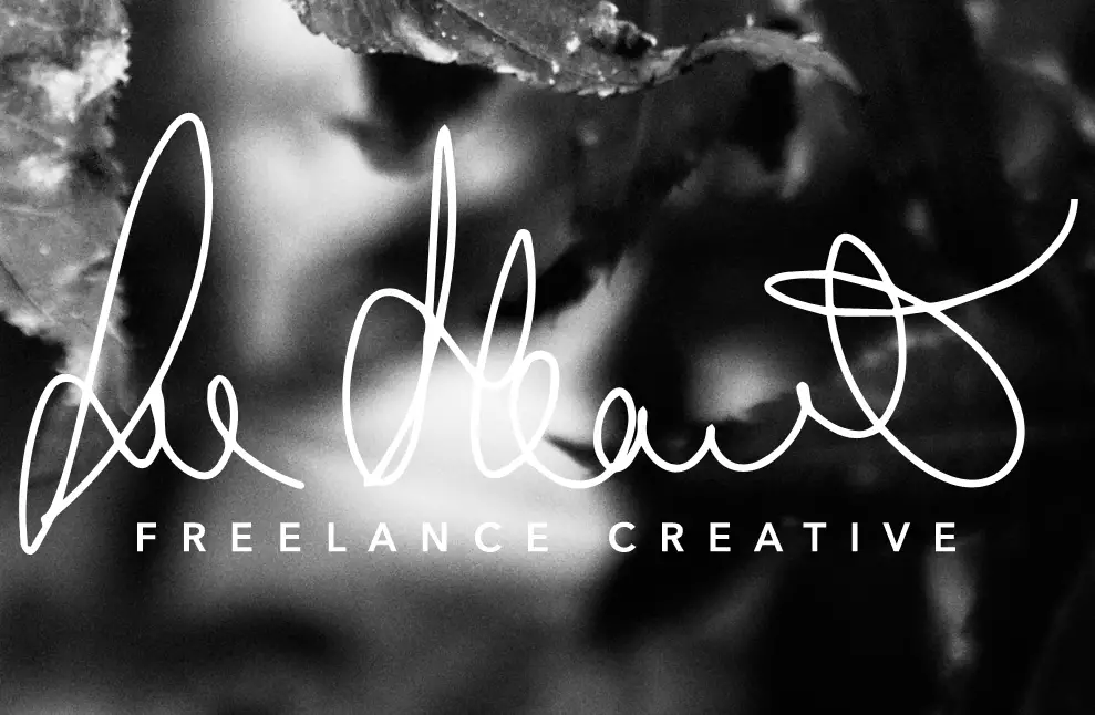
I’ve been using the same photo in my design shop graphics for a while, so that’s what I’m going with. It’s a photo that looks nice zoomed in and in black and white, and has plenty of dark space for me to overlay my logo as a white shape.
3. Open your chosen photo and your logo file.
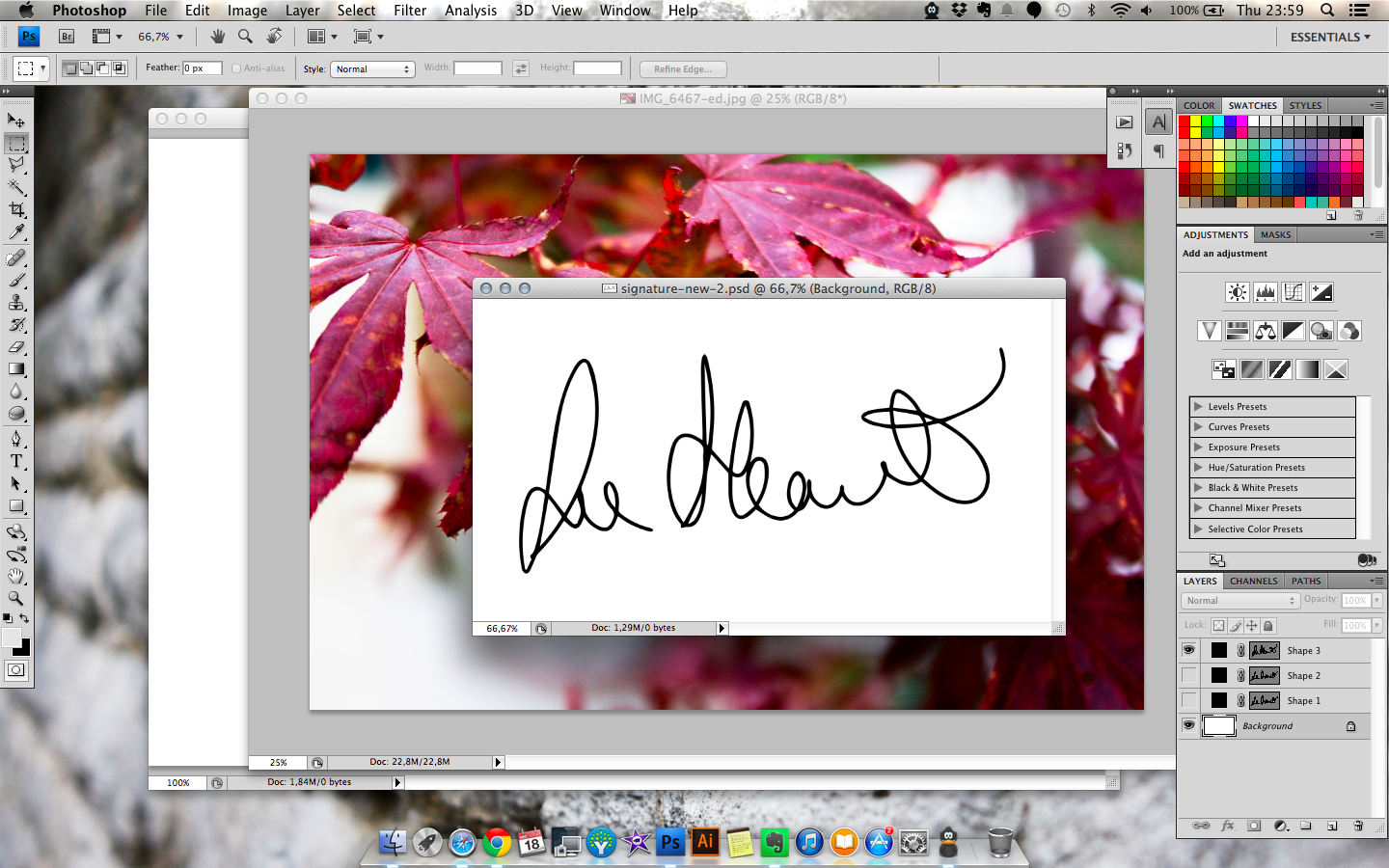
4. Resize your photo. You can make it the same size (or slightly bigger) than your card, or you can make it bigger and use only part of it for the card. I’m cropping mine (and also making it black and white with a gradient map in Saturation blend mode).
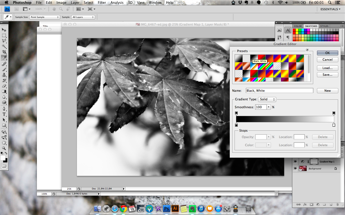
5. Drag the photo onto the card file and position it as needed.
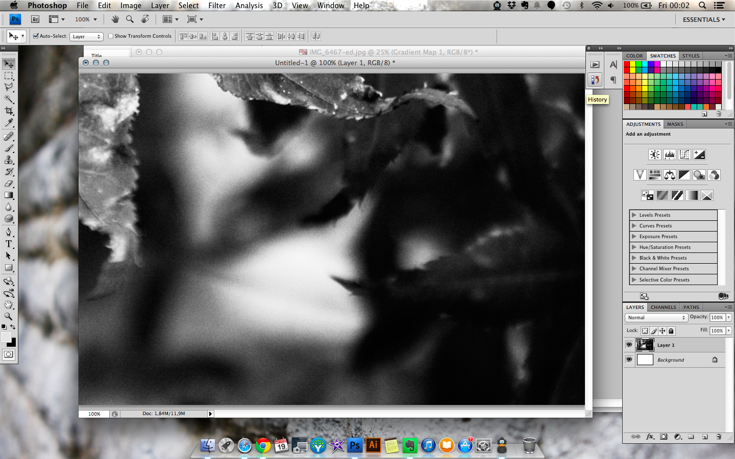
6. Resize your logo if it’s not a vector shape. If not/when that’s done, drag onto the card file, over the photo.
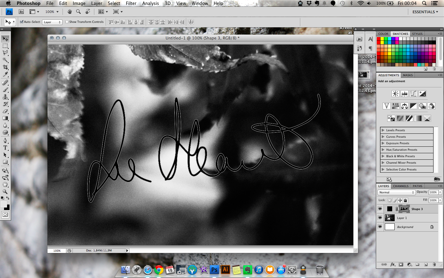
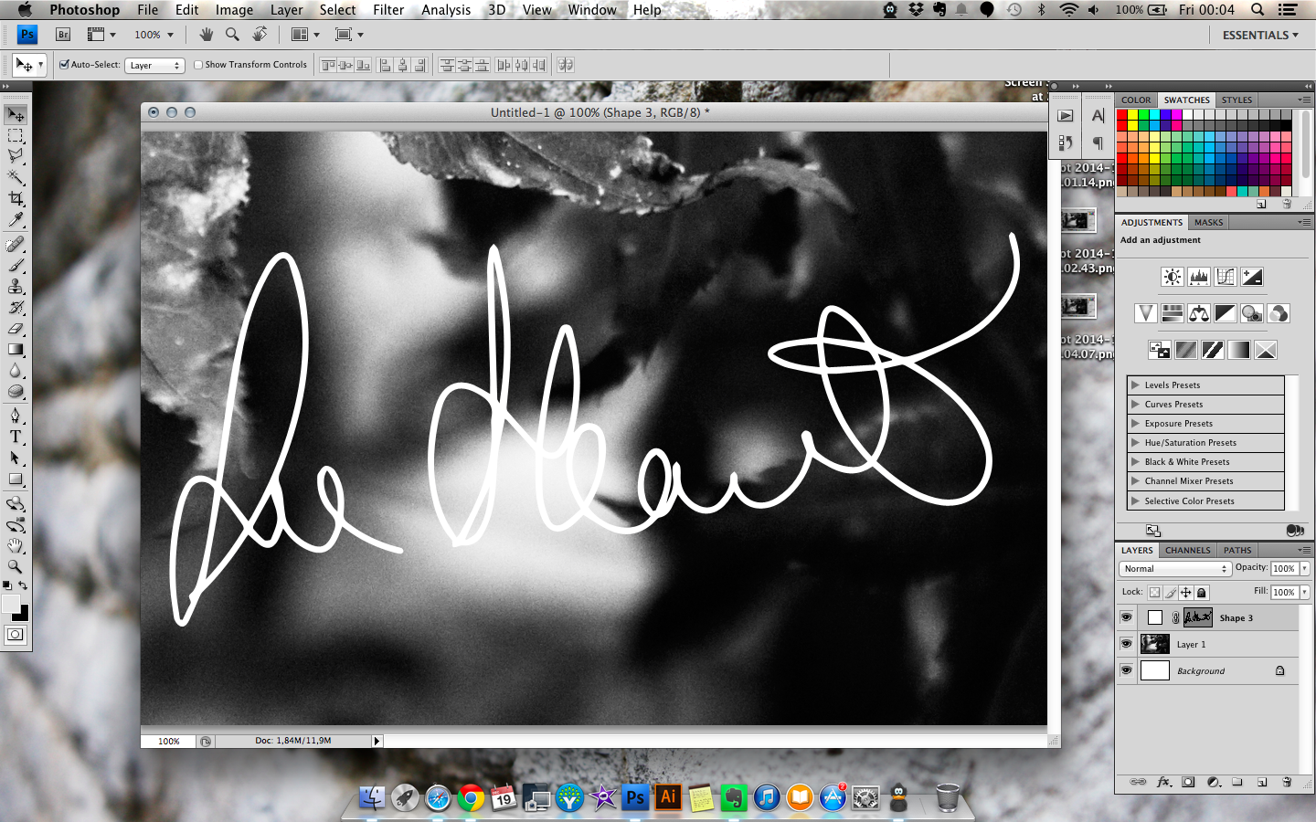
7. Tweak the color and size of your logo to fit.
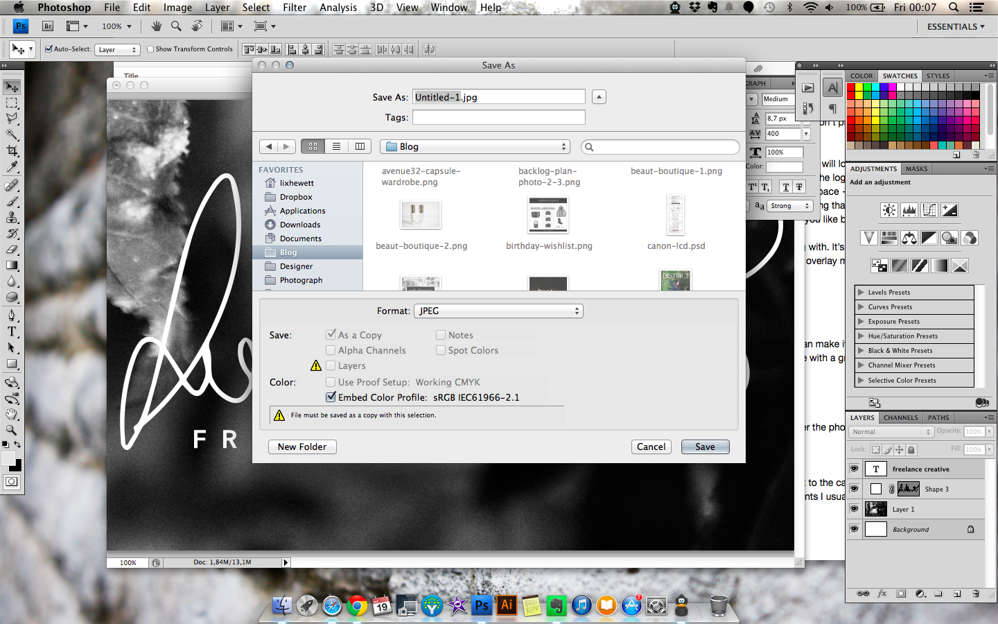
8. OPTIONAL: If your logo doesn’t have this built in and you’ve got room for it, you can add a bit of text to the card. In my case, I’m adding a simple text layer saying “Freelance Creative” in white, using one of the fonts I usually use for my branding, and rotating the logo to accommodate it.
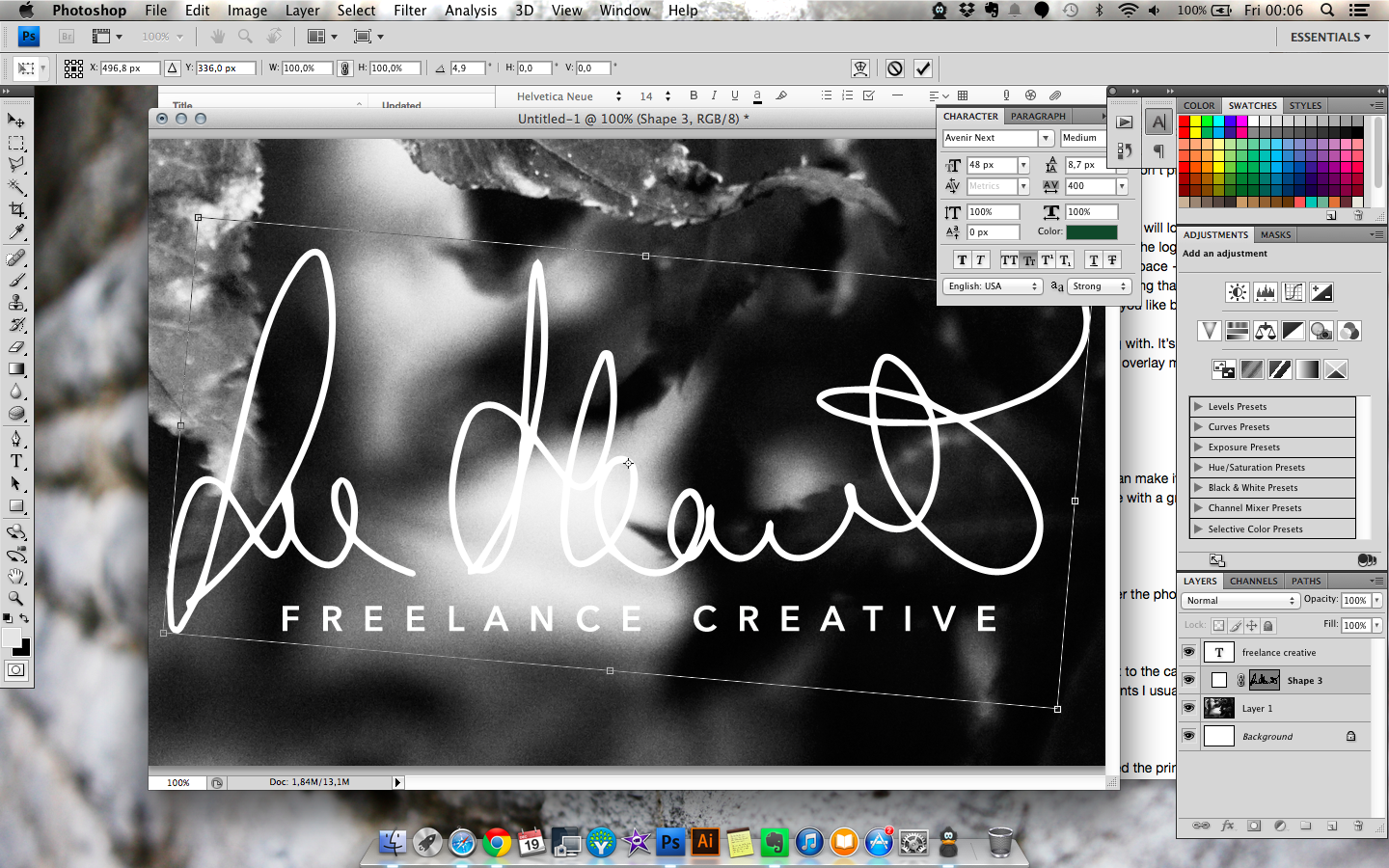
9. Save As > JPG, and you’re done!
The Back Side
1. Open another file the same size as your front.
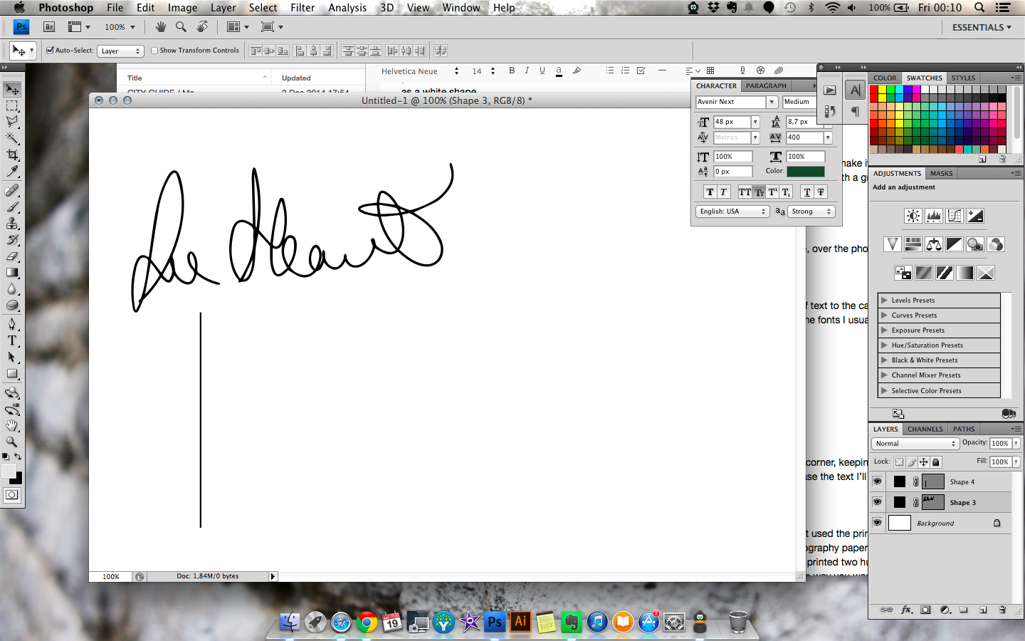
2. I’m using my logo again; this isn’t necessary, but I like it! This time, I’m dragging it into a corner, keeping it black, and making it small. I’m also adding a little line with the Shape rectangle tool to encase the text I’ll be putting into the card.
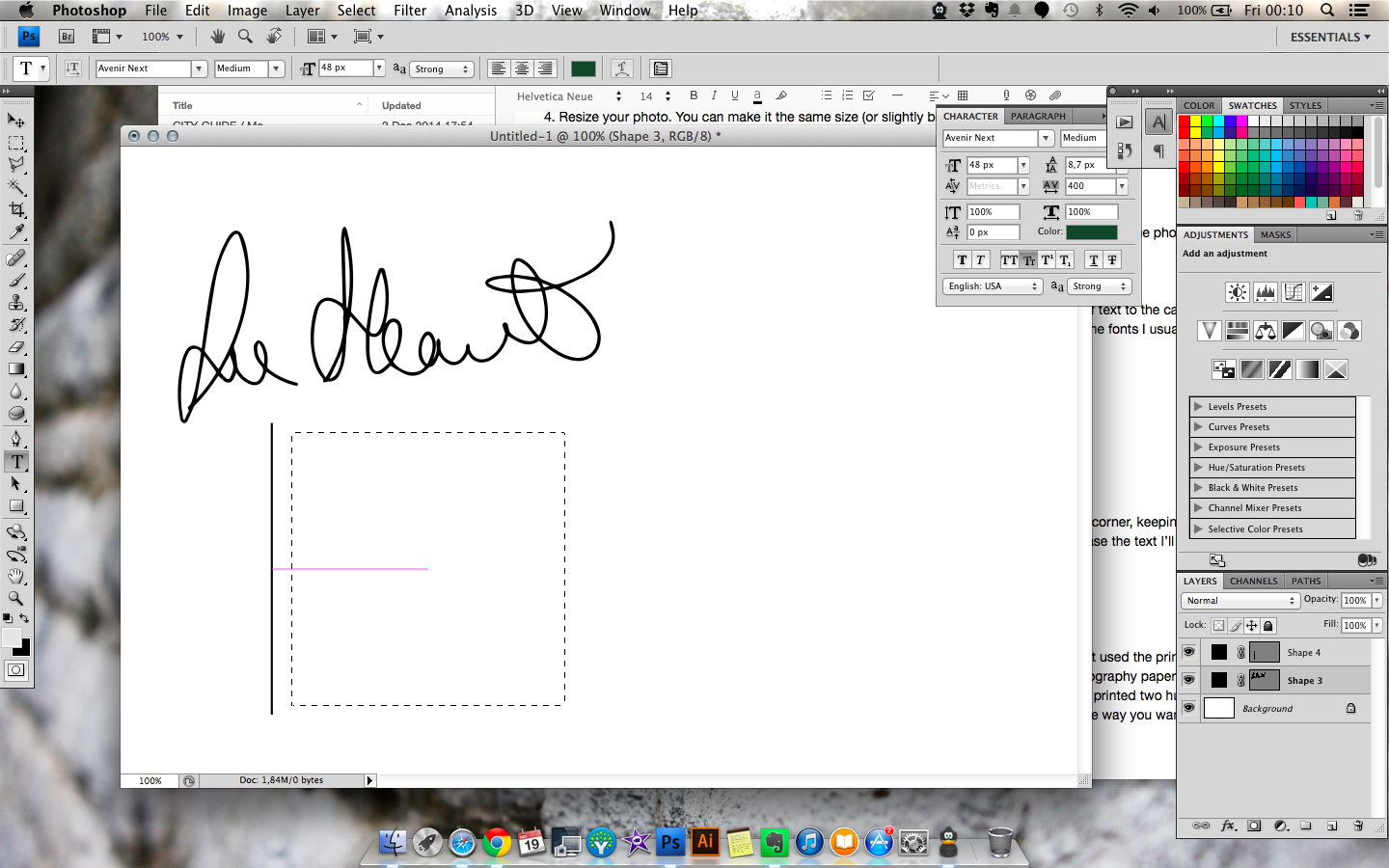
3. Create a text box by selecting the Type tool, clicking on the corner of the box you’re creating and dragging like you would any other shape. When you’re finished, you’ll see the blinking vertical line that means you can type. Start typing your info! Type at least word so you won’t lose the box when you adjust the font, size, etc. in the Character window, at least.
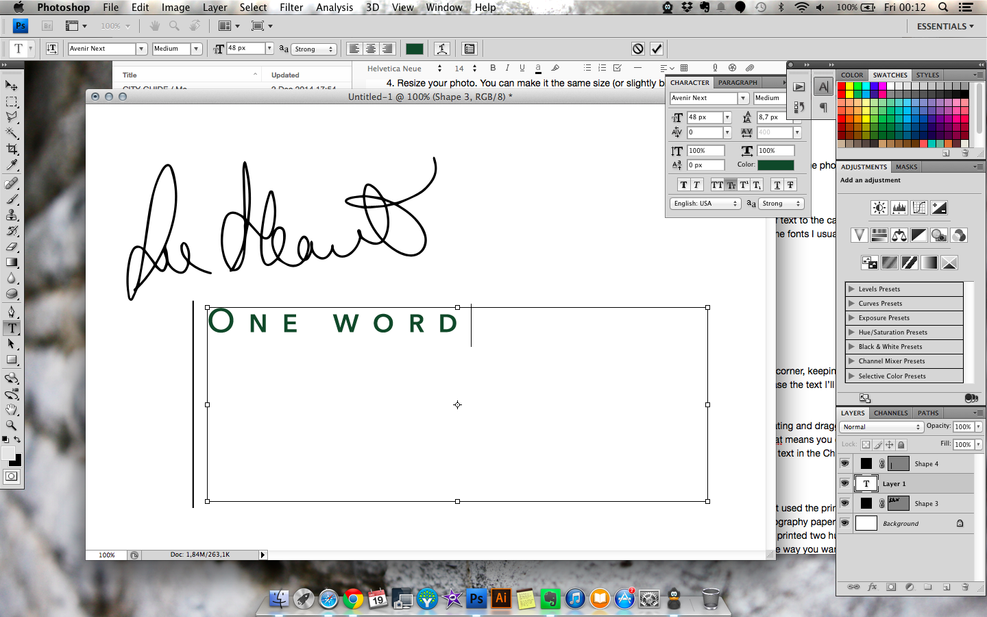
4. Type in your text, and adjust the font size, etc. in the Character window.
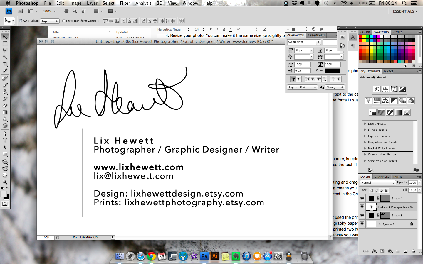
5. Adjust the position of your elements as needed.
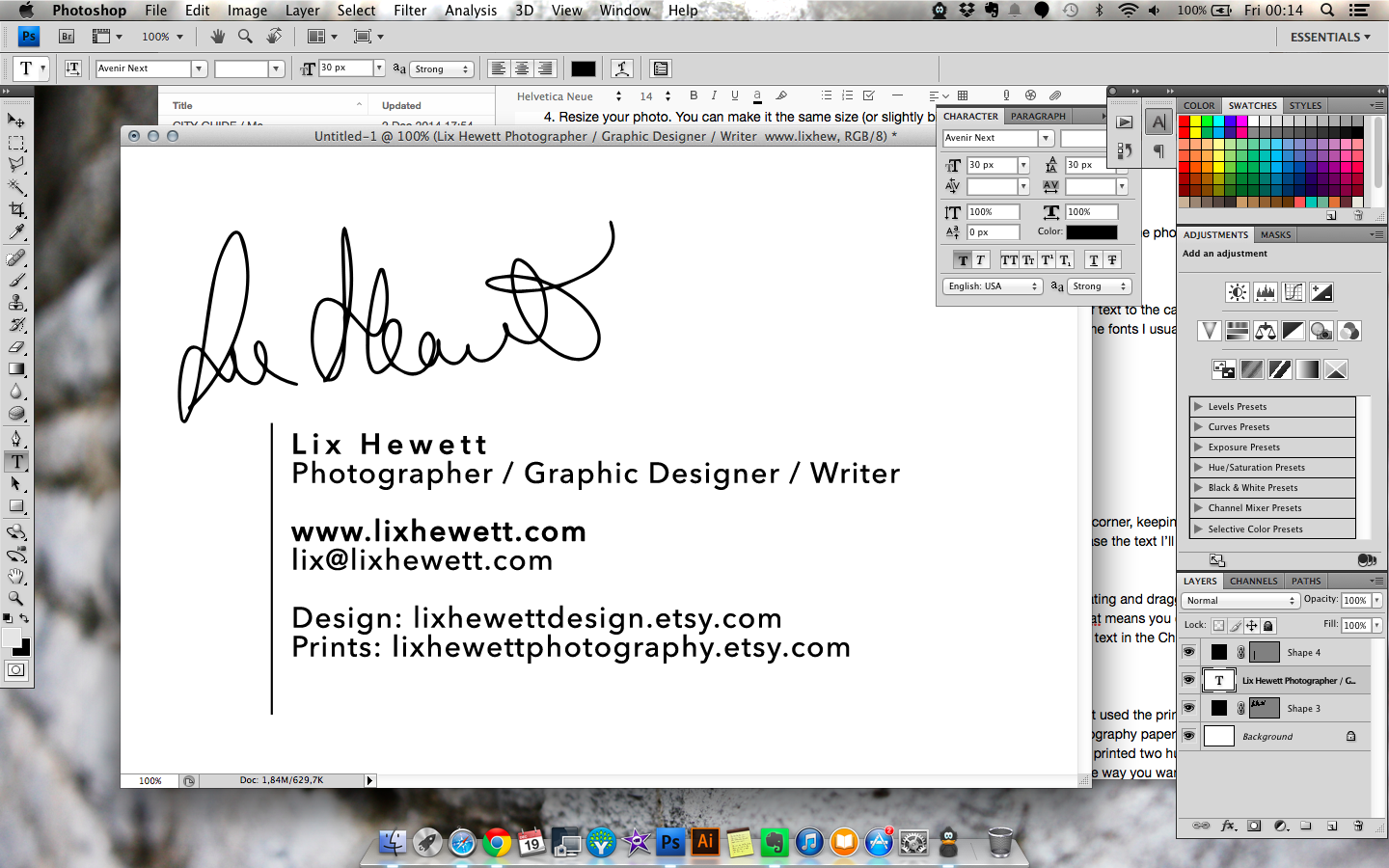
6. Save As > JPG, and you’re done!
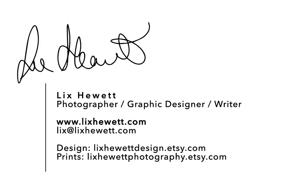
Here’s our final card:
Notes
What to avoid on your card design:
– Handwritten fonts for anything you want people to be able to read
– More than two fonts in the same card, not counting your logo
– Photos that are beautiful but have nothing to do with what you offer, e.g. a picture of a flower if you’re a portrait photographer
– Too many links: I recommend linking your website and your main social media channel and having the rest of your social media links easily visible from those places.
Finally, this goes for all visuals, but applies double to photography: get a sample first if you haven’t used the printer before. Even if the quality is amazing and/or you’ve successfully printed the photo on photography paper before, you want to know how their printers are calibrated before you submit a photo to be printed two hundred times. With a sample, you can adjust brightness and hue so your final cards look exactly the way you want them to.
And if you need inspiration, check out this collection of photography business cards.
I hope this helps! If you follow this tutorial, I’d love to see what you come up with — feel free to show me your work in the comments below!






0 comments