I don’t believe that, as a photographer, it didn’t occur to me for quite some time to look to movies for inspiration and lessons I could use in my own art.
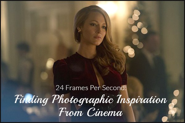
But as I’ve grown as a consumer of movies and art, I’ve learned to look more closely at the choices filmmakers have selected in order to convey information to their audiences.
The proper term for how a scene appears is called mise-en-scène. This is a French term that means “place on stage.” This is a fancy way of saying “everything you see.” And while it’s often easy to believe that most of the things you see in a scene from a movie just happened to be there, directors often put a great amount of thought into small details.
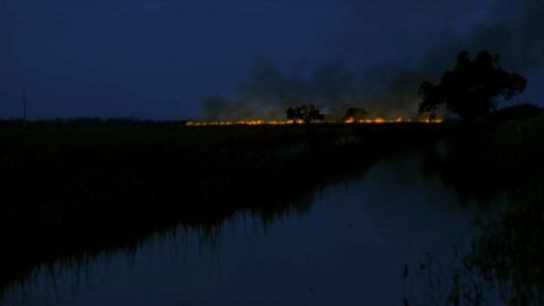
In an effort to expand our horizons, we’ve been thinking about what lessons we might learn from cinema that we can apply to our photography.
Aspect Ratios
As a photographer, you’re probably already familiar with aspect ratios. These are the ratios that determine the shape of your images. Most DSLRs shoot in a 3:2 ratio, while most smaller point-and-shoot cameras shoot in a 4:5 ratio. These aren’t really very cinematic aspect ratios, but you can crop them during your editing process.
The norm today is the 16:9 ratio. This is what most modern televisions use, as well as many computer displays. Android smartphones are designed close to this, with 16:10 screens, so you can watch tiny movies on the go.
Perhaps the aspect ratio with the most cinematic feeling is 2.35:1. This ratio is wider and shorter than 16.9 and 3.2.
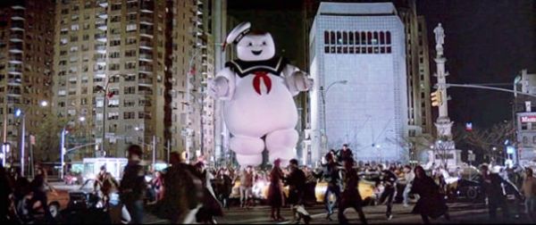
Try different cropping selections to see what works best with your images. It is a good idea, though, to compose your shots as you shoot them with a wide-screen state of mind. The less cropping you do, the better the quality will be in your finished product.
The Case for Visual Efficiency
Be aware of what’s in the frame. This, of course, is true no matter what sort of photography you’re doing. But if you’re aiming for a cinematic feel to your photos, be very judicious about what makes it into the frame. Try to avoid including unnecessary items or people. Make it easy for your audience to focus on your subject.
The Rule of Thirds
The rule of thirds, as you most likely already know, is a handy rule of thumb to help you compose visually interesting images. And it’s a rule that’s often followed in movies, as well. So don’t be afraid to let the rule of thirds be your guide.
At the same time, don’t be a slave to this guideline. Many filmmakers have broken this rule and gotten excellent results. Sometimes, despite what any photo instructor you’ve ever had has told you, it’s OK to put your subject right in the middle of your image.
Create a Story
I’ve mentioned this notion before. In my last post, I wrote about creating a narrative within photojournalism. I also discussed this topic in a piece about occult photography. So it would follow that creating a narrative would come up when discussing cinematic photography.
You don’t need to tell an entire story with one image. As a matter of fact, one might argue that doing so would be less cinematic, not more. What you want to aim for is giving the impression that a story is present, but don’t give enough away that the story is apparent. Make your audience curious.
Colors
Color is one of the best areas to use to make your images more cinematic-looking. Often, films are color-graded to give the entire film a certain mood or tone. You can achieve the same sorts of effects during your editing process. If you’re not sure where to start, here’s a video to help get you started.
Learning From the Masters
Of course, if you want to learn how to give your images a cinematic feel, you’ll need a strong grasp of what that means. And there’s often no better way to do that than to study the work of those who have defined cinema over the years.
Wes Anderson
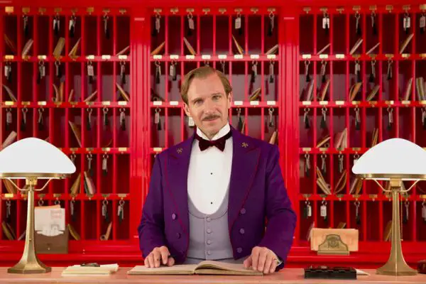
Wes Anderson has made a name for himself as a director for using highly stylized visuals and meticulous color schemes to make his movies visually appealing. You could watch many of his movies without any sound and still be entertained.
If you’re not familiar with his work, I suggest starting with Moonrise Kingdom. It’s a great movie, and the visuals within it are stunning.
Paul Thomas Anderson
Paul Thomas Anderson makes dense movies. He always seems to know how to include massive amounts of information in his scenes. He also has an amazing eye for creating drama with visual cues. I suggest checking out The Master.
Lynne Ramsay
Lynne Ramsay might be the least-known director on this list, but her work is strong and compelling. She is a master of using small details to convey large, abstract ideas. Check out her movie We Need To Talk About Kevin.
David Fincher
David Fincher excels at many aspects of filmmaking, but the one I find most interesting is his methods for using color and tone to create the moods of his films. He is known for often using dark, sharp imagery in his work. One movie that exemplifies this notion is Fight Club.
Stanley Kubrick
Of all the directors we could mention here, and there are too many to list completely, Stanley Kubrick is the most deserving. He was known for being one of the most meticulous, detail-obsessed directors ever to make a movie. Perhaps this is due to the fact that he was a photographer before he began making movies.
Film buffs still pore over Kubrick’s movies today, looking for hidden meanings in the small details he included in his scenes. Picking a starting place for Kubrick is difficult. If you enjoy historical movies, I’d recommend Barry Lyndon. It’s set in a historic period when there was no electricity, so Kubrick shot the entire movie in natural light. It’s incredible.
Are you a film buff? Have you ever drawn inspiration for your photography from a movie? The two art forms are connected in that they are both geared toward the visual, but each form requires a different approach. That doesn’t mean, though, that one can’t influence the other.




0 comments