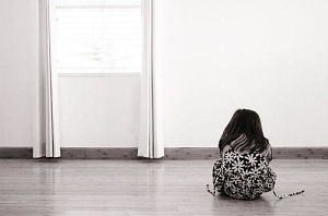
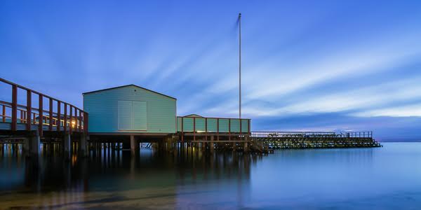
What’s really important is to simplify. The work of most photographers would be improved immensely if they could do one thing: get rid of the extraneous. If you strive for simplicity, you are more likely to reach the viewer. — William Albert Allard, National Geographic
Everything should be made as simple as possible, but not simpler.
— Albert Einstein, Smart Guy
Like a cluttered room in a house or an overstuffed closet, a photo with too much random stuff can make it difficult for a viewer to find the subject. How many times have you taken a photograph of something only to have something else completely unrelated (and unwanted) in the frame like a car or a telephone pole? This isn’t to say that all photos should be minimalist affairs with a single subject and a plain background ala Apple Macintosh ads. But you should strive to only include elements in a photo that add something to it rather than serve as distractions. One way to do this is to simplify your compositions.
Simplification can take many forms. To start, you have two broad choices: move your subject or move your camera. Look at the background when you are framing your subject. Ask yourself, could a change of location simplify your composition, removing distracting background elements? In a natural setting, look around for something that could be used as a simple backdrop for your subject (a wall or a weather-beaten fence, for example). Indoors, consider complementing your subject with an artificial backdrop. Your chosen background, although simple, can still contribute interest to your photograph in the form of texture and color.

Mother Knows Best. 1/80s @ f/4.5
Of course, moving your subject may not always be feasible. In that case, moving your camera is the answer. Moving to a different side of your subject can yield a completely different look. A zoom lens can be used to isolate a subject in a busy scene. Shooting from a high or very low angle usually puts your subject against the ground or sky which can both make beautiful backdrops.

Boy and Blue Wall. 1/60s @ f/4.5
Consider the lighting. A brightly lit room shows every detail. But a dim room with a single spotlight only reveals what the light touches. A dark canvas with a splash of light highlighting a subject, muted details lurking in the dark corners, can make for a powerful image. Shooting subjects in doorways can yield a similar result: a bright subject lit by the sun against the black opening of the doorway.

Solitude. 1/50s @ f/4
Don’t forget about depth of field. The camera gives you precise control over what is and is not in focus in any given photograph. Do not neglect this ability. Use it to blur unwanted elements while keeping other elements in sharp focus.
Finally, look at textures in the scene, clashing lines, colors, and shapes. You may find that colors and textures on your subject clash with something in the background. Or lines in your subject may cross with other lines in the frame at odd angles perhaps forming distracting shapes. A bold, complementary splash of color in the background can make your subject really stand out.

Speed Queen. 1/100s @ f/2
A simple composition doesn’t necessarily mean an easy one. It can be difficult to make a photograph that includes enough detail to convey an idea or represent someone or something in an appealing way but doesn’t overdo it. At first, you may find yourself not even noticing distracting details until they are pointed out by others or until you see the photograph in a print or on your computer screen. It takes a dedicated effort and concentration to simplify your composition at the time you press the shutter button. As you practice, as you develop your eye, noticing things that don’t belong in the frame becomes easier. But trust me, it’s worth the effort.


Thanks 🙂
I’ve been trying to work on this , and this here is definitley going to help 🙂
Great post on lighting and composition! Some great food for thought..