Many elements work together to create a pleasing photograph. One such elements is negative space. Negative space is all the space inside the picture that is not the subject. The edges of any picture form a frame for that picture. Within that frame, the subject is considered the positive area; the rest is called negative space.
The word negative is used descriptively; it is not a value judgment. Negative space is not something to be avoided. However, it is something to be considered, because it is an important part of a picture’s composition. It is a design element in your image.
A stencil can help you recognize this importance. Here the subject is the brass object, but the negative space that forms the letter is equally if not more important.
Negative space has several functions. It helps define a subject. In many cases, it also provides a vital element in the design of your image. Since a photo is two-dimensional, the space around a subject appears on the same plane as the subject. Negative and positive spaces are side by side. The balance between them should be pleasing.
Negative space can appear anywhere in a picture. If your subject is in the center of a picture, the negative space is at the edges. It could also be in the center, as in the this striking image of the Golden Gate Bridge by photographer Michael Fletcher.
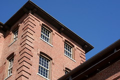
Good photographers consider negative space as they compose a picture. They use the edges of the viewfinder as the frame. This roofline picture, for example, was composed during shooting to ensure that the point of the roofline touched the edge of the picture. The negative space thus created–in this case the sky–echoes the angles and straight lines of the building itself. The sky is divided into geometric sections just as the face of the building is.
Practice learning to see negative space. Just remember that the this space changes as your camera moves. Negative space is not a constant; it is always related to the edge of an image. If the subject fills most of the frame, the negative space is smaller than if the subject fills only a portion of the frame. If the camera moves in any direction, the shape and amount of negative space will change.
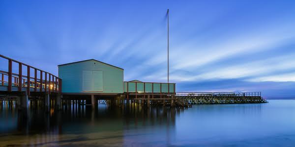
As an example, look at these two pictures with the same subject against the same background. In one, the negative space is small and somewhat insignificant. In the other, it features far more prominently in the design.
Look for negative space in your own best photographs, as well as in classic photos that have stood the test of time. Look for it in Japanese artwork, where it is widely used, especially in early woodcuts and paintings. Learn to recognize the interplay between positive and negative forms. Apply what you have learned to your own work, and you will see an improvement.


0 comments