One of the most exciting things about the modern world is the high accessibility of professional tools for regular people. It provides us with a great chance to enjoy thousands of totally diverse pieces of art throughout the Web and beyond it.
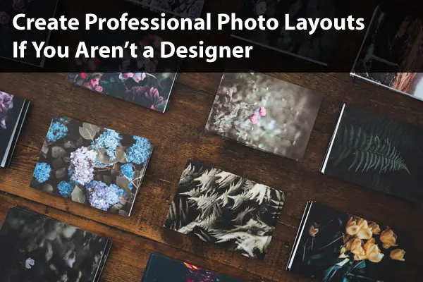
Now you can find hundreds of online offers to create impressive collages, apply beautiful filters, or add text to photos free of charge.
It doesn’t matter whether you are a professional social media marketing specialist or a regular Facebook or Instagram user — you have all the needed resources in your hands such as a collage maker online tool to surprise your followers and boost the performance of your account.
You might say that you don’t have the required skills to design great layouts. However, there is no obligation for you to possess such knowledge. Moreover, by simply following several tips described in this article, you’ll be able to apply astonishing modifications to your future posts.
Don’t Blur the Essence of Your Composition
All quality photo layouts capable of engaging thousands of people have to carry a polished idea or concept. In case it is a collage consisting of several images, there should be a meaningful connection binding them together. These links can be established by the photo (or photos) itself, but they can also be highlighted by a written text covering them.
When you are thinking about a message you want to deliver to your community, take into account the interests, preferences, and reasons that brought these people to you. If you don’t have a fixed audience yet, thoroughly consider the story that you want to tell to your future followers.
Appreciate the Power of Fonts
The content of your message is not less important than the style used for writing it. Don’t hesitate to go beyond traditional options like Georgia, Times New Roman, Helvetica, Calibri, and others. Let your imagination fly even further and choose 2 or more font families for one picture. Combine different styles, weights, line-heights, and other parameters, and also feel free to rotate your text box.
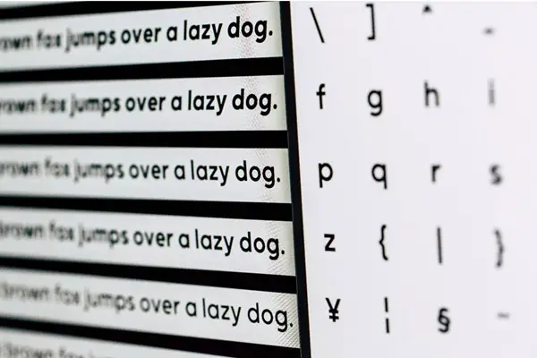
Fonts massively influence feelings that your reader will experience while examining your post, tweet, or any other type of content. Yet, don’t cross the line while mixing different font families, as some of them are simply not meant to be placed near each other. You can look up matching styles in your favorite search engine since there are useful web resources, which will definitely come in handy.
Align Each and Every Element
While a design is much about creativity, it is rarely chaotic; consequently, it follows certain rational ideas in its composition. Thus, when you see that something is wrong with your layout, maybe it lacks some balance and harmony. Basically, you can put on your photo (or collage) a so-called grid, which will help you see the direction that you have to maintain while applying new elements and effects.
Working on your picture, you can search for composition guides on the Internet. They are usually prepared by professional photographers and are supposed to help you align elements within each cell of the grid.
Avoid Complicated Pictures
When you are passionately adding new details to your layout, it can happen, from time to time, that you overload it. You have to limit your appetite to new photos or text boxes. In addition, try to maintain a specific palette of colors, which is capable of delivering a proper, targeted mood without blurring it.

The picture above represents an example of such color palettes or color combinations, which shows how different shades perfectly complement each other.
Create a Clear Separation Between Concepts
When constructing a complex collage with lots of images involved, you can somewhat improve their individuality by adding rather thick borders between them. This way, every photo will uphold its identity without ruining the overall picture. Thanks to creating a structure like this, a text block that you might be willing to add will still have some space, which it needs to properly deliver a message.
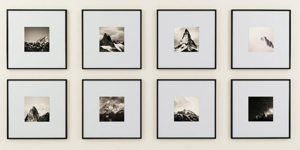
Border implementation is a well-known technique often used by savvy and qualified designers.
Find Inspiration in Things That Surround You
There is nothing to be ashamed of if using references to pieces of art made by other designers or artists. Of course, you can find them in galleries or even on the streets of your town, but you can spot even more muses online.
Pinterest is among the most popular platforms, which provides thousands, if not millions, of references that you can use to create astonishing photo layouts. However, keep your eyes peeled, as you can bump into more useful web resources while surfing the Internet.
Conclusions
Obviously, you can’t become a designer after reading a few articles. Nevertheless, with these few pieces of advice, you can show your fan base your unique vision of our world and its objects in an attractive and ordered way.
Click on the following link to learn how to design a mood board to showcase your work.


