Yesterday I wrote a little bit about histograms and dynamic range. Histograms are a very useful tool for evaluating an exposure. You should activate the histogram display on your camera and learn to use it. But you must remember that a histogram does not, by itself, say anything about image quality. Histograms must be evaluated within the context of the image that they represent for them to have any value.
All a histogram does is show you the range of brightness within a given image. To evaluate whether the shape of a histogram is “good” or “bad” you must compare it to the image it represents and have an understanding of what kind of exposure was being attempted.
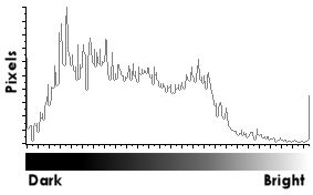
Sample histogram
Many photographers just try to create images with a histogram which hasn’t been clipped on either end (“blown out”). A histogram that hasn’t been clipped shows that the entire dynamic range of the scene is contained within the image. The trouble with this approach is that sometimes a non-optimal exposure must be used to capture the range. It can lead to muddy images that have to be heavily post-processed. This can be perfectly acceptable as it gives some latitude in how the image will be “developed.” I would just caution you to avoid the trap of expecting to recover a lot of detail in dark areas on shots like this as they’ll probably contain a lot of noise.
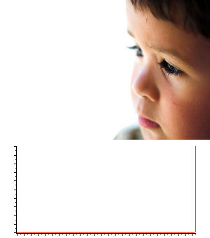
Untitled. 1/500s @f/1.8
This is just about the “worst” histogram I’ve ever seen (red line). It is
virtually flat and shows almost everything blown out. But the background
was blown out intentionally as part of the composition.
Many common, real-world scenes simply have a dynamic range that is much greater than film or a digital sensor can record. Blowing out some highlights is not a sin! Specular reflections; flecks of sea foam on the water; white, front-lit clouds in a stormy sky… these things are really, very bright and it’s perfectly fine for them to blow out a little. You decide how much is acceptable to you and what is appropriate for a given scene. How much is too much? My only advice is to avoid large areas that are blown out or where there is a severe transition to a blown out area.
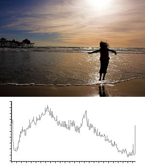
Jumping into the sea. 1/640s @ f/13
This scene has more dynamic range than the sensor could record. Both the dark
and bright sides of the histogram are clipped. But the exposure is correct,
showing a silhouette against a bright sky, just as I had intended.
So how do you use the histogram? It depends on what you are shooting:
- Determining if you’ve lost detail in an image by viewing it on a 2-inch LCD screen is pretty difficult. But you can quickly review the histogram to see if you’ve blown anything out and by how much.
- If you are trying to capture maximum detail in the dark area of a photograph, you’ll want to make your exposure so that the histogram isn’t clipped on the dark end. If the histogram is clipped on the dark end at all then some detail has been lost in the darkest areas of the scene. As you add exposure (by using slower shutter speeds or opening the aperture), the histogram will shift further to the right.
- If you are trying to capture maximum detail in bright areas, you’ll want to make your exposure so that the histogram isn’t clipped on the bright end. As you decrease the exposure (by using faster shutter speeds or closing the aperture), the histogram will shift to the left.
- If you are trying to make an image with a lot of contrast, you’ll want the histogram to cover areas on both the dark and bright ends. Conversely, you’ll know your image isn’t very contrasty if the histogram is bunched up in one area.
And remember that a “good” histogram for one image isn’t necessarily good for another.


I follow your articles and I like very much your practical approach to photography. Thanks for all your effort.
One note: histogram on the first image is instructional but at the same time a little misleading. You should check the Y-axis scale. More than 1/3 of the picture contain non-white data not represented in your histogram.
Otherwise a fine article. Keep posting!
Thanks for reading, Fabian! I’m glad you like the site. The histogram does show data all along the x-axis for the non-white pixels. But there are so many *more* pixels that are blown out that makes the histogram look this way. Histograms can definitely be misleading! Never trust anyone who says a photo is good who has only looked at the histogram. 😉