Whether you’re feeling artistic or not, good composition is important for making images that resonate with viewers. Everything else being equal, poor composition can create an itch in a viewer—a subconscious and annoying one that can’t be scratched.
Composition in photography refers to the arrangement of elements in an image. Those elements can be subjects, foreground, background, and props. They can also be color, focus, and balance.
It can be a difficult concept to grasp which is why people invented “the rule of thirds.” In this article, I will explain everything you need to know about this rule, along with all the examples you will need to become a master at it.
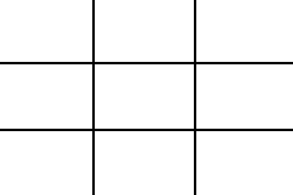
The theory of the rule of thirds is that aligning your subject along one of these lines or at an intersection of them makes a stronger composition. So essentially this gives you four lines in the photo where you can place your elements, as well as four intersection points where elements can land.
This is not magic, its how our brain works, so both photographers and film makers have used it for years in their compositions. Its based on the fact that our eyes tend to go to these intersection points naturally in an image, so instead of fighting that tendency why not utilize it to your benefit.
It is believed that this arrangement of objects in the photo creates tension, interest, and energy, which are what you are looking for when taking a photograph. Putting your subject directly in the center gives your photos a boring, “snapshot” like feel. Putting the horizon exactly in the middle of the photo has a similar feel. Try it for yourself, that’s the best way you will see this.
When you start using the rule of thirds, try to picture the lines which divide the viewfinder into 3 equal parts in either direction, whether you are in landscape or portrait orientation, and experiment with placing subjects you want emphasized on these lines or intersections. Move the camera around and take several shots with various subject locations in the frame.
Keep in mind that you are trying to imagine the image is divided into 9 equal parts, so this means the parts may be of different size, especially if you are using a non-standard viewfinder of sorts such as a square or 16:9 ratio one for filming.
When you are done experimenting with such placement, take a few photos by breaking the rule and see how those come out.
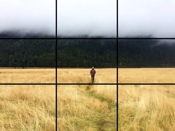
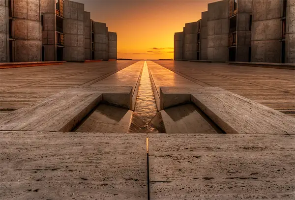
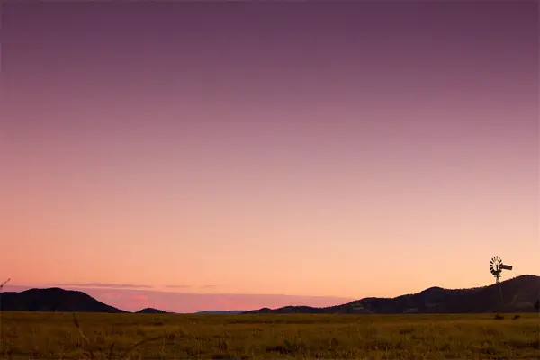
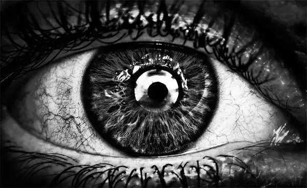
EXAMPLE
Let’s see how the rule of thirds works in an example below:
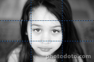
I shot this image yesterday. The model is my daughter. This is the uncropped (though obviously resized) image. I’ve drawn the rule of thirds lines on the image. As you can see, the subject is centered. The photo isn’t bad but I think it can be improved with a little cropping.
Here is one…
And another…
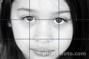
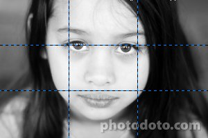
The two crops above take two different approaches. In the first, I’ve aligned the models eyes with the first horizontal line. The idea, since this is a portrait of a person, is to make eye contact with the viewer. Humans are genetically wired to respond strongly to eyes and faces.
The second is a much more severe crop which attempts to align not only the top horizontal line but also both vertical lines. In my opinion, it definitely draws you into her eyes more.
However, I think both of those crops (and the original) suffer from a lack of balance. In all three of the above images, the right side of the photo feels “heavier” to me. This is caused by the large patch of black hair on the right. When I look at this photo I feel slightly uncomfortable, almost as if the image will fall over if it isn’t propped up by something. In addition, the bottom crop feels unbalanced vertically with her chin being cut off.
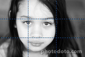
This final crop addresses the balance problem. The hair is still there but I’ve shifted everything to the left and thankfully she has a complete chin again. The left eye is almost at the top left intersection. I cropped the image so that it was below the intersection to balance the image vertically. I think this is a much stronger crop than all of the others, including the original, and is the version I published.
As you can see, the rule of thirds is a really just a guideline. And it isn’t something you’re supposed to follow blindly. Rather, it’s a distillation of wisdom regarding the placement of objects within your camera frame to achieve the strongest composition. I keep it in the back of my mind and use it as a helpful reference. But I often crop images without consciously using it (or even better—compose in the camera with this in mind) and find that important elements of the image happen to fall on the rule of thirds lines and intersections anyway.
Built In Camera Guides
You may have noticed that some cameras have a built in rule of thirds feature, and so do some cell phone cameras. Just look through the menu and see if yours happens to have it. It will look like an overlay that appears over the live view and divides the images as we have discussed.
You can even find rule of thirds overlays built into photo editing software and apps. This lets you apply it in post production even if you may have not remembered to do it while shooting on location. I do a lot of this- using taken photos and cropping them while keeping in mind the rule of thirds and saving several alternative images.
If your software does not have it built in, it is quick and easy to make the gridlines from scratch, by eyeing it or pulling up the ruler in your editing software like photoshop and drawing guides on the image or even lines on a separate layer which will not affect your photo.
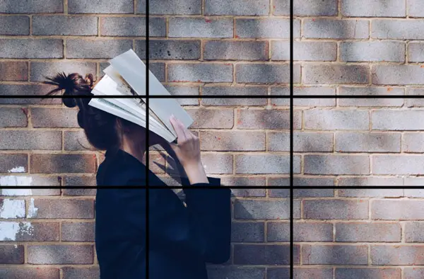
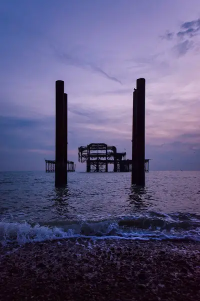
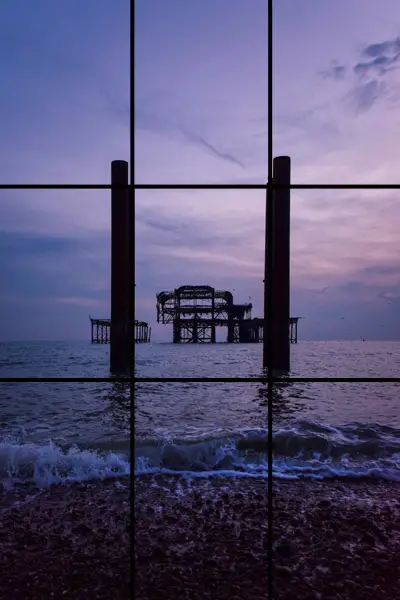
More Examples
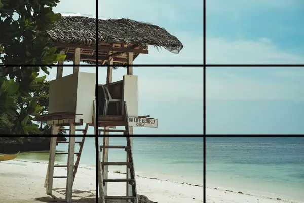
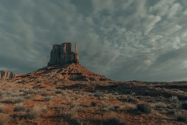
Below are some more examples of photos that to an extent apply the rule of thirds. Look first at the photo without grid lines and see how you feel about the composition and balance.
Without grid lines:

With grid lines:
Without grid lines:
With grid lines:
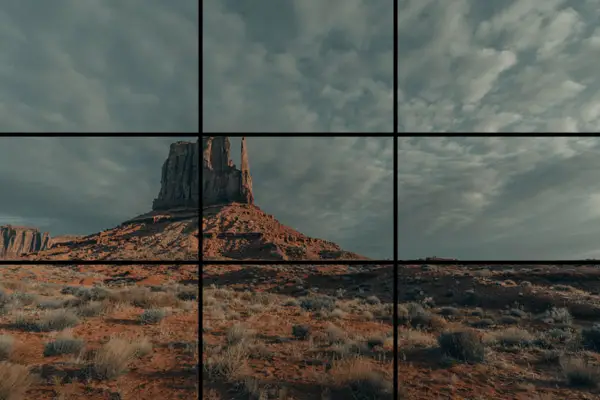
Without grid lines:

With grid lines:
Without grid lines:
With grid lines:
Without grid lines:

With grid lines:
I hope that these examples have illustrated what I described earlier. The rule of thirds is just a guide. It is not fixed and does not have to be followed exactly. You do not need to place your points of interest on every line and you do not need to include every line. You have the freedom to use as much of the rule of thirds as you want. You can combine it with other rules in photography.
But as the saying goes, if you want to break a rule its best to first know the rule you are breaking.
HISTORY
The rule of thirds has some real history behind it. It was first described in an illustrated painting book in 1797 called “Remarks on Rural Scenery”, by an artist and engraver by the name of John Harvey Smith .
“Analogous to this “Rule of thirds”, (if I may be allowed so to call it) I have presumed to think that, in connecting or in breaking the various lines of a picture, it would likewise be a good rule to do it, in general, by a similar scheme of proportion; for example, in a design of landscape, to determine the sky at about two-thirds ; or else at about one-third, so that the material objects might occupy the other two : Again, two thirds of one element, (as of water) to one third of another element (as of land); and then both together to make but one third of the picture, of which the two other thirds should go for the sky and aerial perspectives.”
His long-winded, highly awkward and ancient-prose version is basically saying… split your composition up into three equal parts, vertically and horizontally. Then put the interesting stuff on the lines or at the intersections of the lines.
Or another way to say it is, when you’re taking a photograph of a friend, put them off to one side and not dead center.
It was again described in an 1845 book called “Chromatics”.
You can read more about the history of the rule on Wikipedia. Whats interesting is that there was always skepticism about the rule of thirds.
When To Use It, When To Lose It
The rule of thirds has been around for so long that it’s tough to say who came up with it. Long before the camera was ever invented, artists used it as well as the golden ratio to make their masterpieces as far back as the Renaissance.
Because we are talking about a “feeling” and how your eye processes a photograph. Here’s how it works: In general, allowing for individual differences, a person’s eye will be drawn to the most eye catching part of the photograph. When the image is in the center, then the eye is often done. The eye heads to the center first, and if it sees it, then it’s finished. It’s ready to move on (aka bored).
But if it’s off to one side, then the eye will move to it, and it can also move around the frame, although it’s more about a feeling. When you see a good photograph, you feel something.

John Watson
Maybe you’re the rebellious type, though…”I don’t follow no rules, mannnn. I’m an artist.” Okay, maybe that’s just what my muse says to me. And I hear that and have at times done the same thing.
But this rule works. In fact, if this is new to you, then you can dramatically improve your photographs by using it. Simple photographs like a photograph of a dandelion on a bench or your girlfriend can be improved. In fact, many DSLRs help you out by letting you turn on “Grid View,” so you can see where the lines are as you shoot.
If you don’t believe, do your own experiments. You could try photographing the same subjects, then putting them on Facebook, Instagram or your social network of choice and seeing what people respond more to.
“Learn the rules like a pro, so you can break them like an artist.” – Pablo Picasso
But there are also times to break the rules, of course, or there wouldn’t be that cliche…
Every rule was meant to be broken. Here’s when to break the rule of thirds:
1. Emphasize the Symmetry:
Flux Eternal by Sairam Sundaresan
Sometimes in a landscape, the symmetry is so beautiful that to show it creates a striking sense in the person. Like the above. Although a perceptive person will also look at the horizontal lines and recognize that, although the vertical channel is right in the center, the photograph also has lines along the rule of thirds horizontally (do you see them?).
You can find this symmetry in other instances.
2. Macro Photography

Starburst Snowflake by Don Komarechka
Snowflakes are beautiful because they are symmetrical, just like the dimensions of a woman’s face. You can also find this symmetry in butteries, flowers and nature in general. When you are taking close-up photography, then you may want to just put it up close and personal. Is there enough detail that it works without using this?
3. Emphasize One Subject
Droughtmaster Country by Matthew Post
This photograph breaks the rule of thirds in a way that makes the sky seem more. They are deliberately showing more of the sky and creating an emphasis.
4. Your Eye Tells You, Too
O by AimishBoy (Nadav Bagim)
Ultimately, your success or failure as a photographer comes from being able to see beautiful things with your “eye.” Which is really your eye connected to your brain and who you are.
“The important thing is not the camera, but the eye.” – Alfred Eisenstaedt
It’s important to learn these rules, use these rules and break these rules, all in an attempt to really SEE.
“The single most important component of a camera is the twelve inches behind it.” – Ansel Adams
What do you see?
What do you want to share?
When you can see the beauty in the world, use the tools you have. Then, you can make photographs that will delight others.
Below is a useful video summarizing the rule of thirds:
Do you break the rule of thirds? When and how did it work for you? Please share in the comments below and/or ask a question, and we’ll try to answer it personally. Thanks.
For an article on using triangles to improve your portrait compositions click the link.


Since I started paying more attention to the Rule of Thirds a few years back, I’ve received many more compliments on my photos. Plus, with cropping, I’ve been able to go back through my older pictures and remake them, like you did above, into more pleasing compositions. Basically, bringing them back to life! I think it’s the single-most important tool an amateur photographer can use to improve their pictures. When it’s so easy to crop photos on the computer (I use Picasa), I don’t understand why people don’t take a little bit of time to do it.
I still don’t quite understand yet.
Could you maybe use rule of thirds on a landscape?
Sure you could. Remember it’s just a guideline intended to help you make your images more dynamic. Imagine a landscape with tree. Imagine two versions of the photo: one with the tree dead center and one with the tree off-center. Or take a look at these examples. You can overlay a rule of thirds grid on many of those. With landscapes, horizons especially.
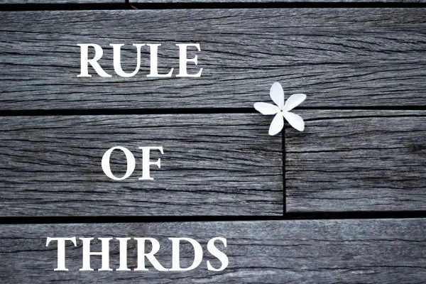
I am glad you gave the link above leading to the Flickr landscapes. Those photos show anybody the Rule of Thirds – which you chose not to do. The RoT is not (just) about placing one single target into the relevant points on a flat homogenouos background – generally. Even the single flower on the photo on the top of this page is not that case – we have horizontal lines there which balances to an extent the unbalanced. With objects/lines/patches with less importance (if it has a role its importance is not secondary, however).