How you compose and frame your portrait is important for creating visual impact and connection with the viewer. It can dictate the mood and feel of the portrait, making it feel inviting or uncomfortable.
Knowing a few rules, and how to break them effectively is a good place to start. In this article I’m going to give you some general rules you can follow to help improve your portraits through better composition.
General Portrait Composition Tips
#1 – Get closer!
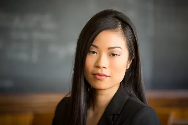
In general beginning photographers tend to include too much stuff in their images, too much space around the subject. The same is true for portraits. In my classroom when I teach this topic I often see people with a 50mm lens standing too far away from their model, leaving the person small in the frame. Fear of encroaching on someone’s personal space can come into play.
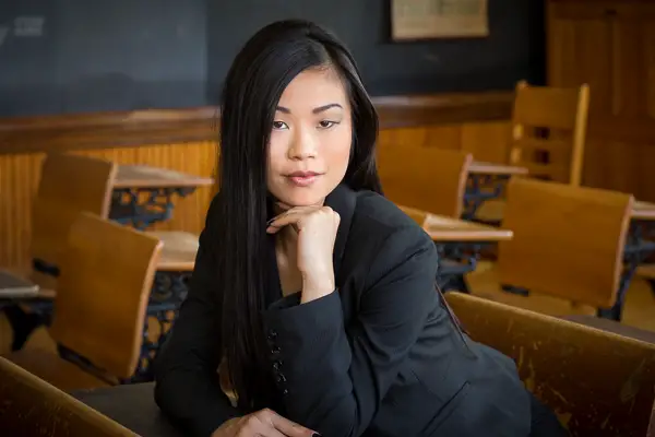
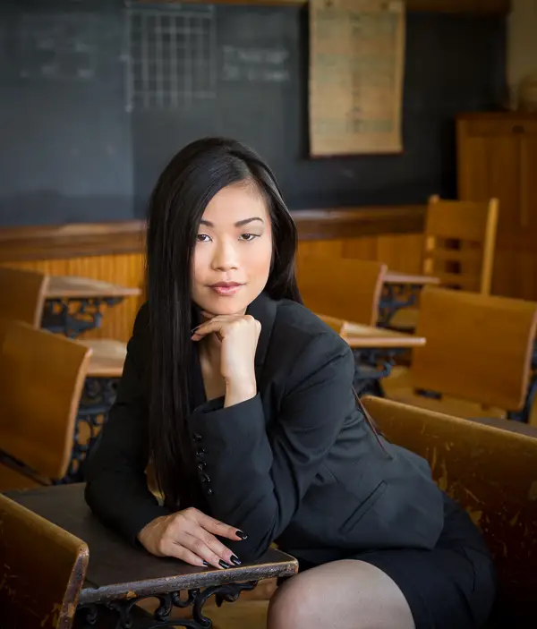
So if that sounds like you, then you may want to invest in a longer lens, which are better for portraits anyway as they are more flattering to the subject. Look at the two examples below. The first was shot with a 50mm lens (on a full frame camera) and the second closer one was with a zoom lens set at 120mm.
Notice how much more impact the closer portrait has? In which image do you feel more drawn to and connected with the model?
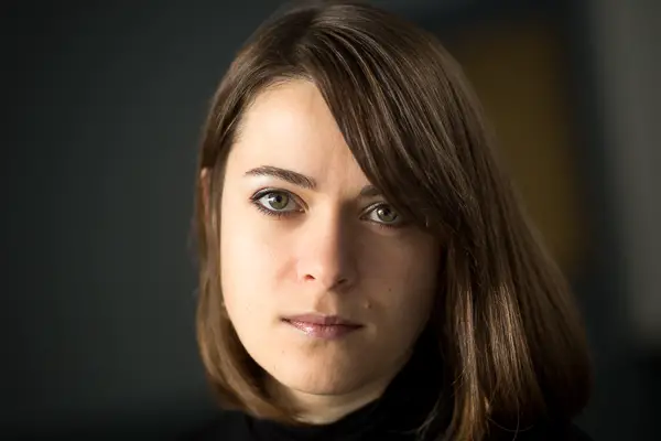
#2 – Use the rule of thirds
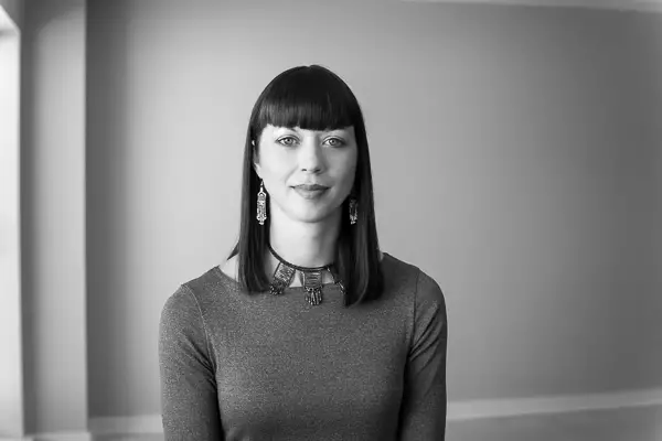
Portraits with the person smack in the middle of the frame feel a bit average, boring even. Using the rule of thirds, as you would for any of your photography, place the subject off-center to add interest. Let’s compare the following two versions of the same portrait. Portrait composition 03 In this version the model is dead center and the image feel static.

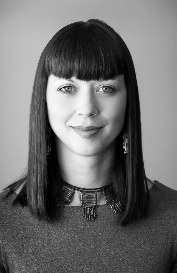
Just by cropping in a little bit and putting her off-center it puts more of the focus on her, and feels more dynamic than the first one. Here are a couple more examples using this tip.
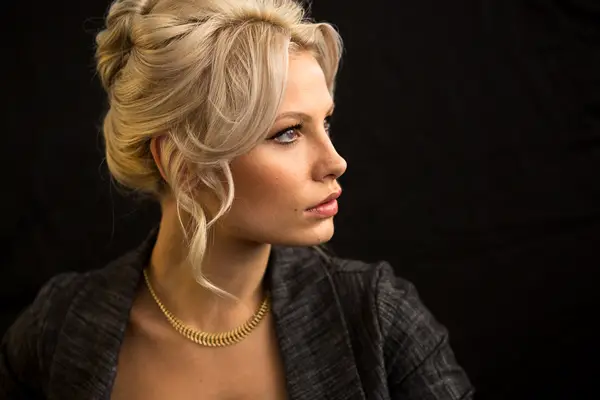
As you may have noticed, I love horizontal portraits of head shots. But what if you want to shoot it vertically? In that case use the eyes for the rule of thirds placement. This is not set in stone, as we’ll see later about breaking rules, but a good starting point.

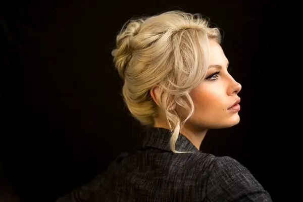
The camera is tilted slightly for a little interest, and they model’s eyes are roughly on the third line placement. So even though she is mostly centered side to side, think about where the eyes and face are in relation to the frame. If you are going to leave a lot of space around the subject, know WHY you are doing it. Have a purpose for the space and compose with intent. Here are some reasons why you want to leave some space and a look at how much space is enough.
#3 – Leave enough space above the subject’s head
We already talked about getting closer, another issue I see is the opposite problem and that’s not enough space above the subject’s head. You don’t want them to feel cramped or crowded in the frame so leave just the right amount so it feels comfortable. This takes practice and experience, but here are some examples to help you. In all of the portraits above the models have sufficient head space, but not too much so as to feel lost in the frame (with exception of the first one). In the image below she has very little space above her head. Can you see how it feels a bit tight and awkward?

#4 – Leave enough of the shoulders for a good base
This type of to counter the tendency to go from one extreme (too much space) to the other (not enough space). Yes really tight head shots can be really stunning, dynamic and powerful – but a head needs something to sit on or it looks bit odd, like a floating head. Think about sculptures you may have seen in museums. When you see a bust sculpture, what is on the bottom supporting the head? Right, part of the shoulders. Same applies in photography, the head needs a base.
Now she has no head space and no base and is literally just a head. Please tell me it’s not just me, and this feels really weird to you too?
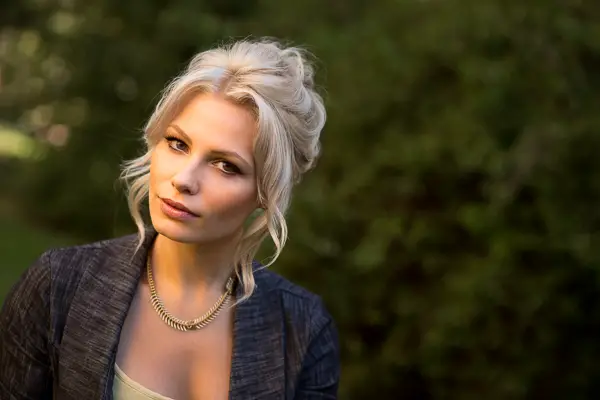
#5 – Leave space in front of the subject
Back to space again. As I said earlier it may seem contradictory to both get closer and leave more space but it’s about finding the right balance, how much space, and where it’s placed. When you have a portrait with the person looking in one direction ideally you want to leave more space in front of them – allowing them space to look – as opposed to behind. Not to say you can’t do the opposite, as you’ll see later, but it feels more comfortable with space for them to look or move forward.
Compare the feelings between the portrait above where she has forward space, to the one below. What’s the difference? Does the one below feel more uncomfortable to you? Perhaps even wrong?
#6 – Watch your cropping of body parts
Try to avoid cropping off your subject’s hands or feet – either leave them in or crop in tighter to the knees and elbows. When you crop off a small part of an appendage it tends to look amputated, like something is missing or it’s a mistake. But when you come in closer it’s obvious you’ve done it on purpose.
Cropped a bit too tight, the model is missing a few fingers and it looks odd. It’s also a bit close on the top of her head and overall the portrait feels crowded.
Much better framing for this portrait has space above her head and all of her fingers included. Notice how the legs are cut off at the knee but that doesn’t feel as awkward as the missing fingers.
Breaking the rules
Okay once you have learned and practiced the rules it’s time to start pushing the boundaries and breaking them. But, as I said above, do it for a reason. Know why you’re composing a portrait the way you are, and what affect it will have on the mood of the final image.
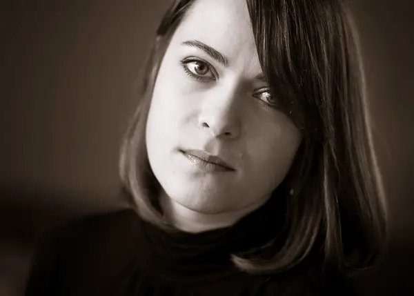
#7 – It’s okay to crop into the head
As in the profile portrait you saw above, sometimes cropping into the head can create a dynamic, interesting look for a portrait. Just be careful you don’t go too far, or don’t crop in far enough.
To me the cropping above feels just about right so this was my final version of this image. Look at this compared to the ones below now.
This one doesn’t go far enough. Just taking the top off her head is like amputated fingers.
Now she’s missing part of her forehead and it starts to get weird and feels uneven to me.
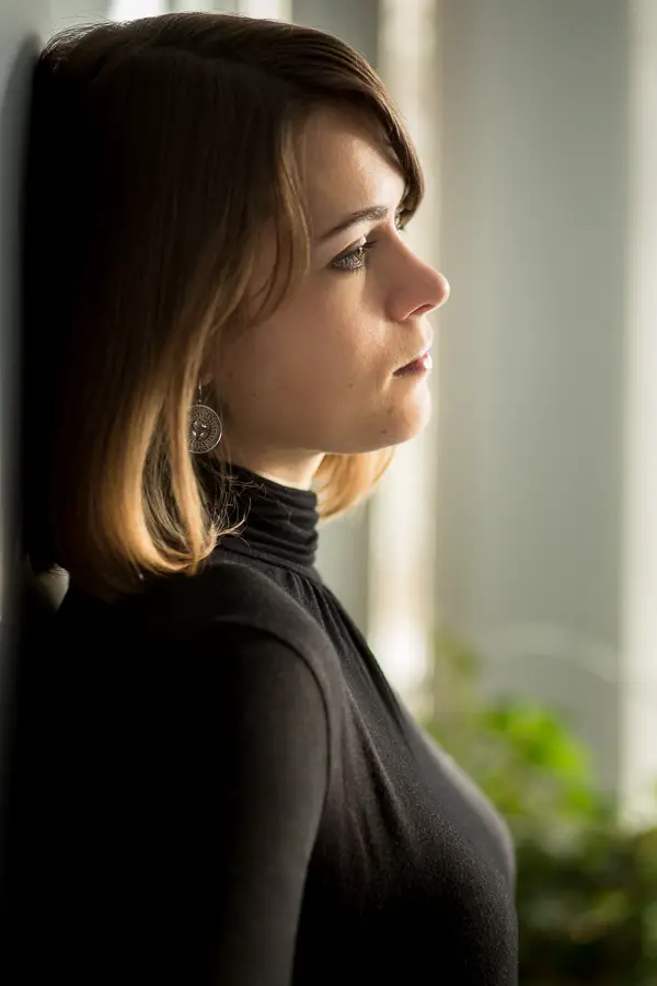
#8 – Put more space behind the subject
Remember I talked about putting space in front of your subject and we looked at the one that was opposite of that? The one thing to keep in mind if you are breaking this rule is that by doing so you create tension in your image. Once again, if that’s the look and feel you want – then by all means go for it. But knowing this you can make educated decisions on subject placement within the frame.
In the portrait above the model is turned slightly to the left but the space is on the right. This gives the image some tension and makes you wonder what she’s up to, as it adds an air of mystery as well.
#9 – Tilt the camera
When you’re photographing things like landscapes or architecture you usually want to make sure the horizon and any verticals are straight. With portraits I throw that rule out the window as one of my favourite ways to add movement is to tilt the camera. Diagonal lines are infinity more interesting and have more flow than straight ones. In fact the one above was shot at a tilt also. But keep this in mind:
A 5-10 degree tilt will seem crooked, while a 30-45 degree one will appear intentional.
Here’s an example of a portrait shot both straight up, and with a tilt. Which feels like it has more movement and flow?
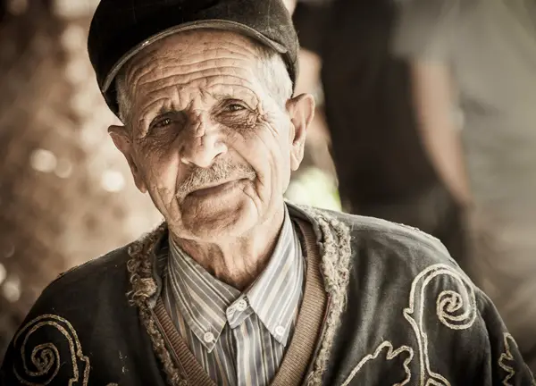
This gentleman was happy to pose for me in Turkey and I added a tilt here as well so the lines behind him were not so straight up and down. Notice when you add a tilt in camera to a portrait it also shifts the position of the shoulders. This can be a good thing. Having one shoulder higher than the other looks less stiff and if your model cannot do that pose naturally, just create it with a camera tilt.
#10 – Get creative with composition
Last but not least is to get outside the box. Dare to be different. Push the boundaries and just try things to see what it looks like. Try things like: compositions with the subject in the lower third and lots of head space, horizontal head shots like I enjoy doing, different aspect ratios like square or even a long thin panoramic shot. The point is – there really are not rules. Nothing in photography is cut and dried or hard fast good or bad – they just product different results and moods. So experiment, but if you’re doing portraits for clients do it on your own time, or get their permission to do 10% of the session with “something different” just for you. You might be surprised at which images they end up liking the best – often it’s the experimental stuff you did, not the safe ones they asked for in the first place.
So how will you improve your portrait composition? Do you have any additional tips or things I haven’t mentioned? Please share in the comments below.


I have used tilting to put a little interest in a shot only to have the client ask me to “straighten” it. Some people just do’t get it. You really have to know the customer.
Googled for some ideas for better portrait compositions and found this amazing article. Very well written and well explained. I will try to incorporate some of them in my next shoot. Thanks! 🙂